Spilled Milk is a fictional coffee brand and café concept developed for a younger, style-conscious audience—primarily high school and college students. The brand identity balances playful charm with modern elegance, using a palette of bold, fun colors and minimalist design elements. This project showcases branding, visual identity, and environmental design tailored to youth culture and casual sophistication.
Mood Board

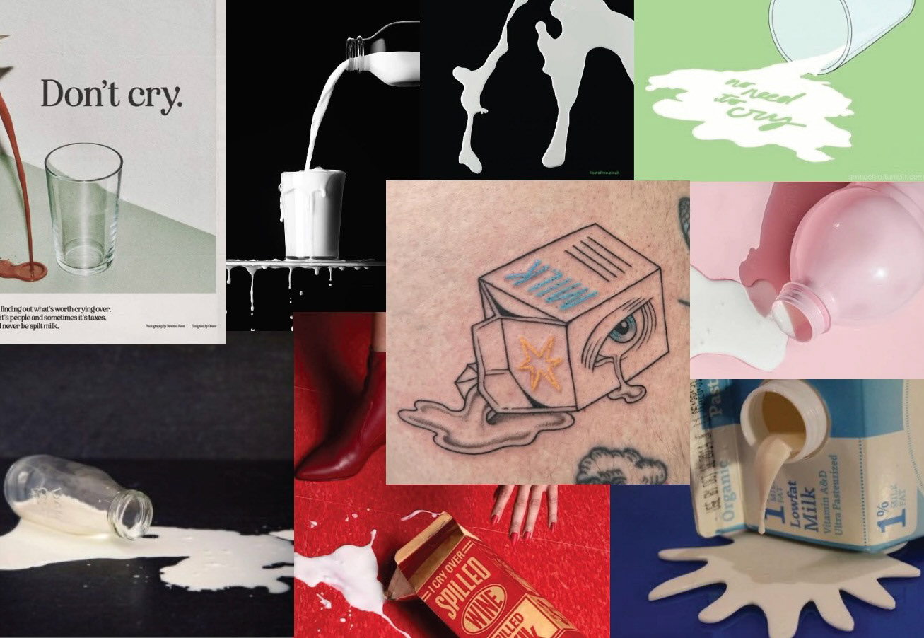
For this personal project I wanted to create a coffee brand that targeted a younger audience. I started with a mood board of other coffee companies that I found to have intriguing wordmarks and color schemes.
Concept Sketching
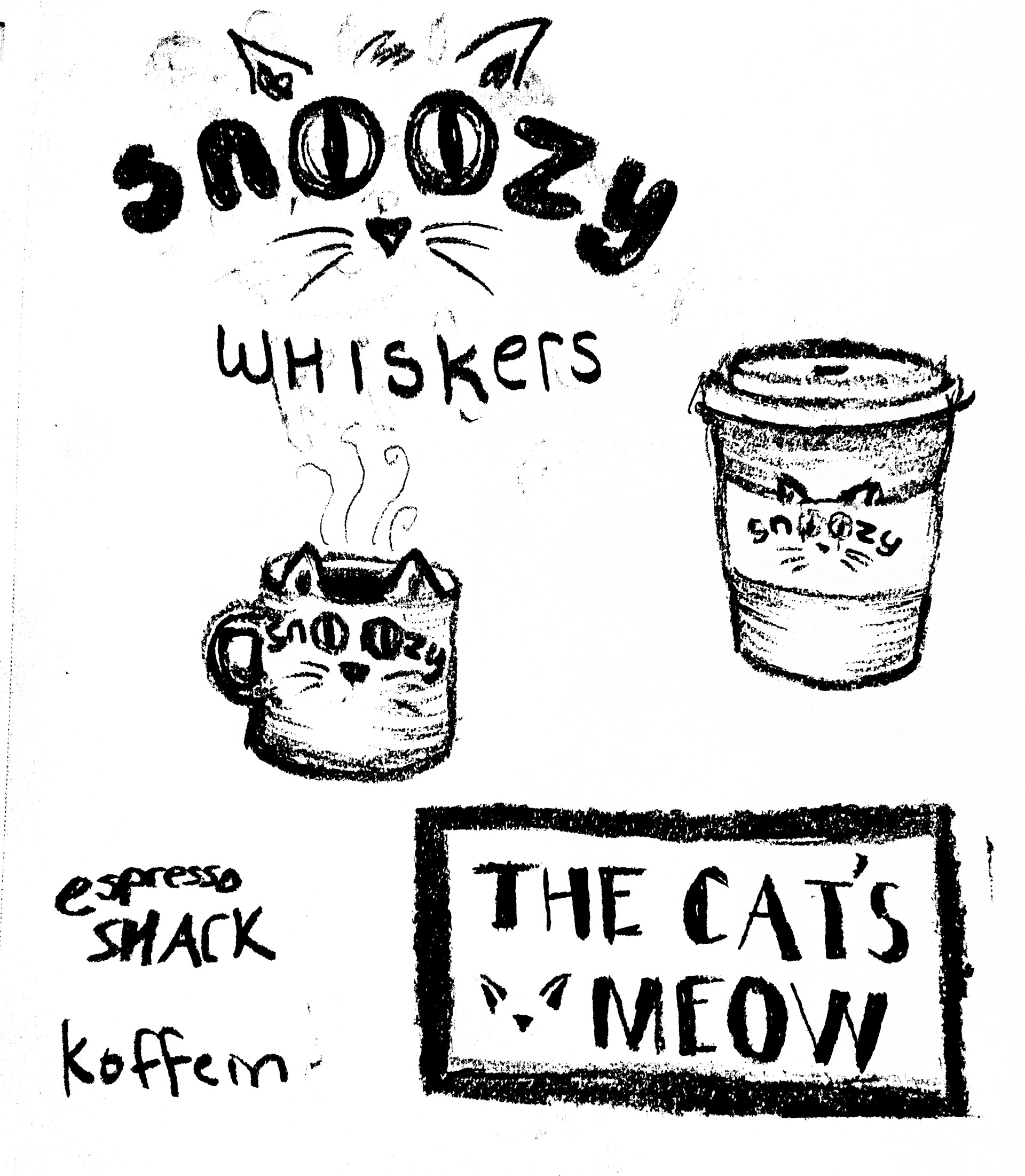
my initial plan was to do a cat café, however after a few concept sketches I changed course. I fell in love with the name "spilled milk" and started iterating from there.
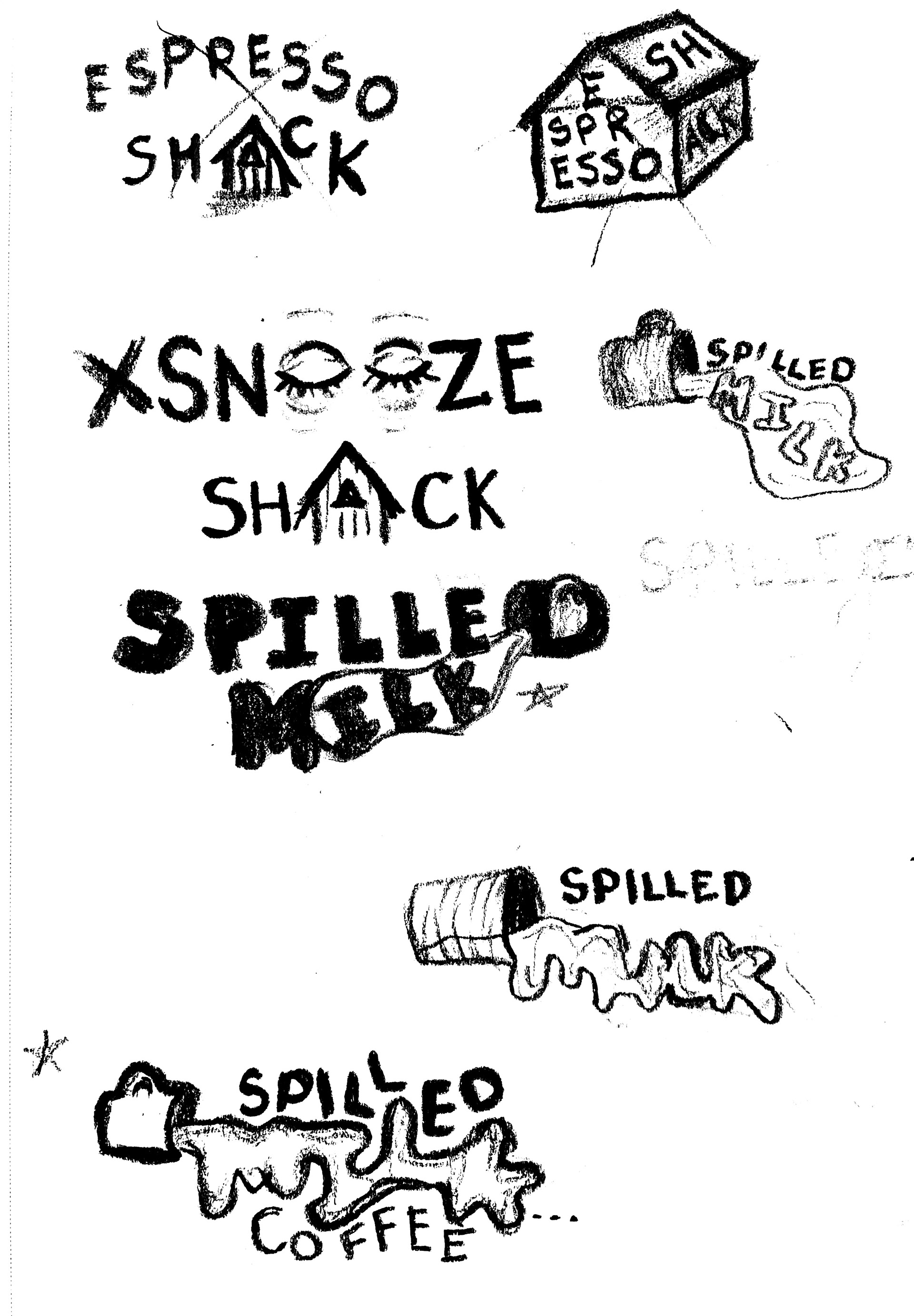
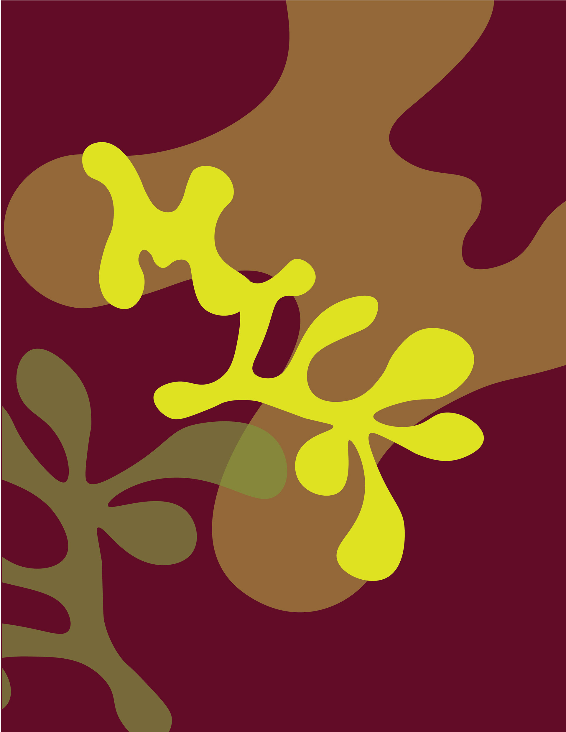
Graphic Iterations
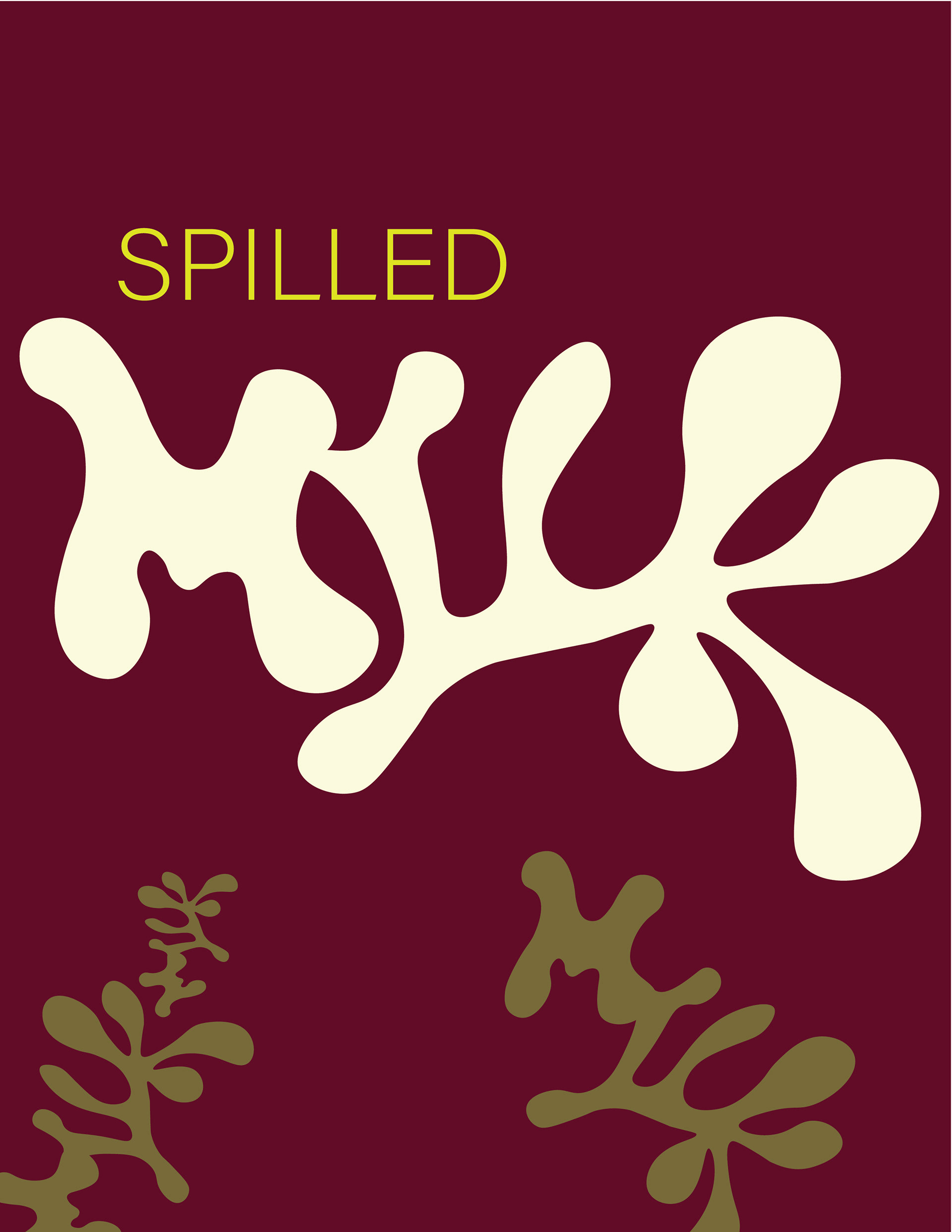
I knew I wanted the word 'milk' to appear as a spill, however I initially struggled to balance intrigue with legibility. I started with a loose image of a cup in the wordmark to emphasize the spill. However, with guidance from my mentor, I scrapped to cup and went in a more bold direction.
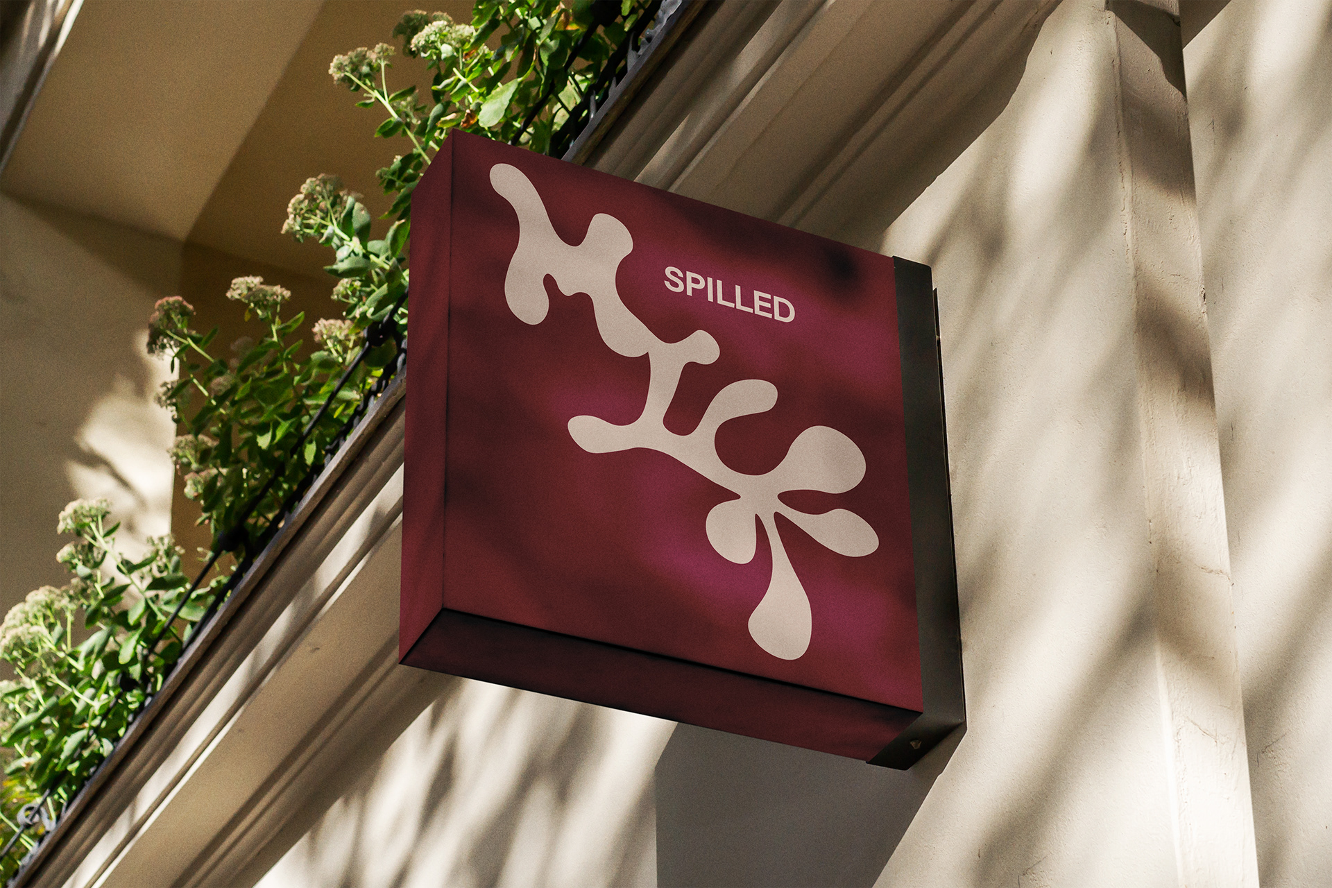
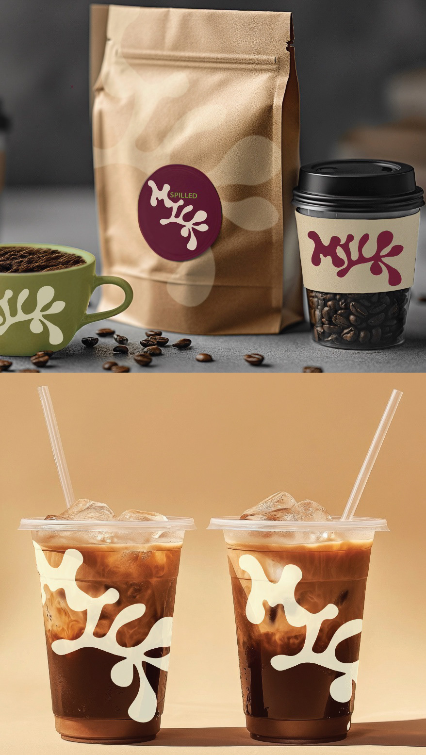
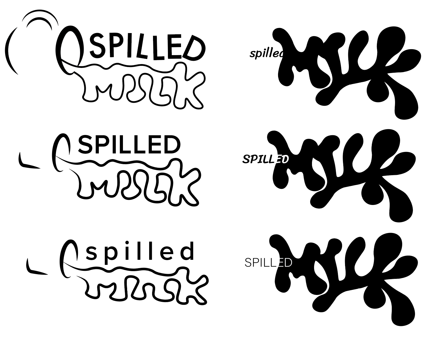
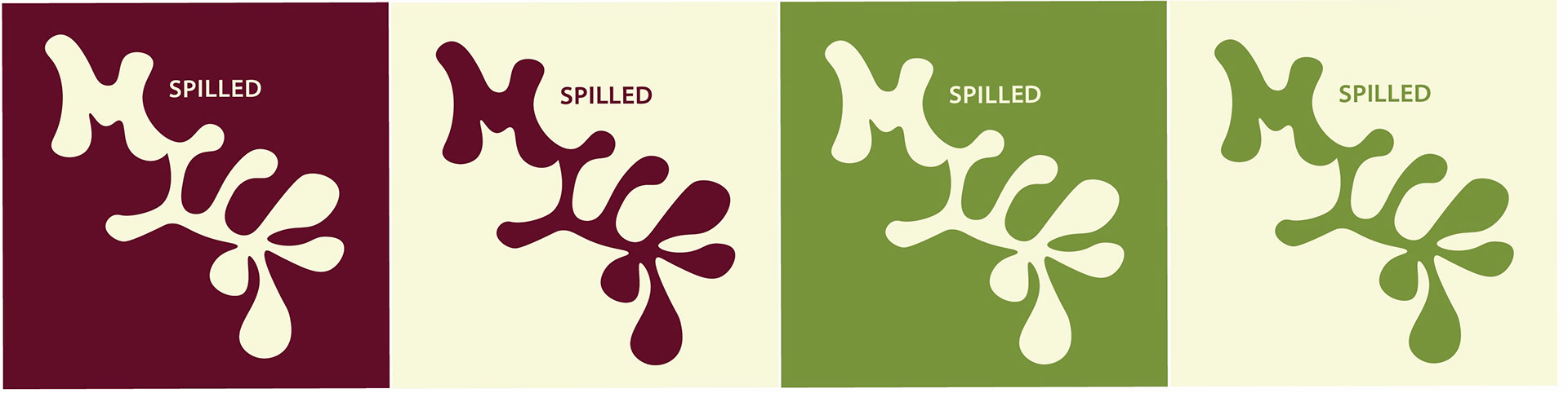
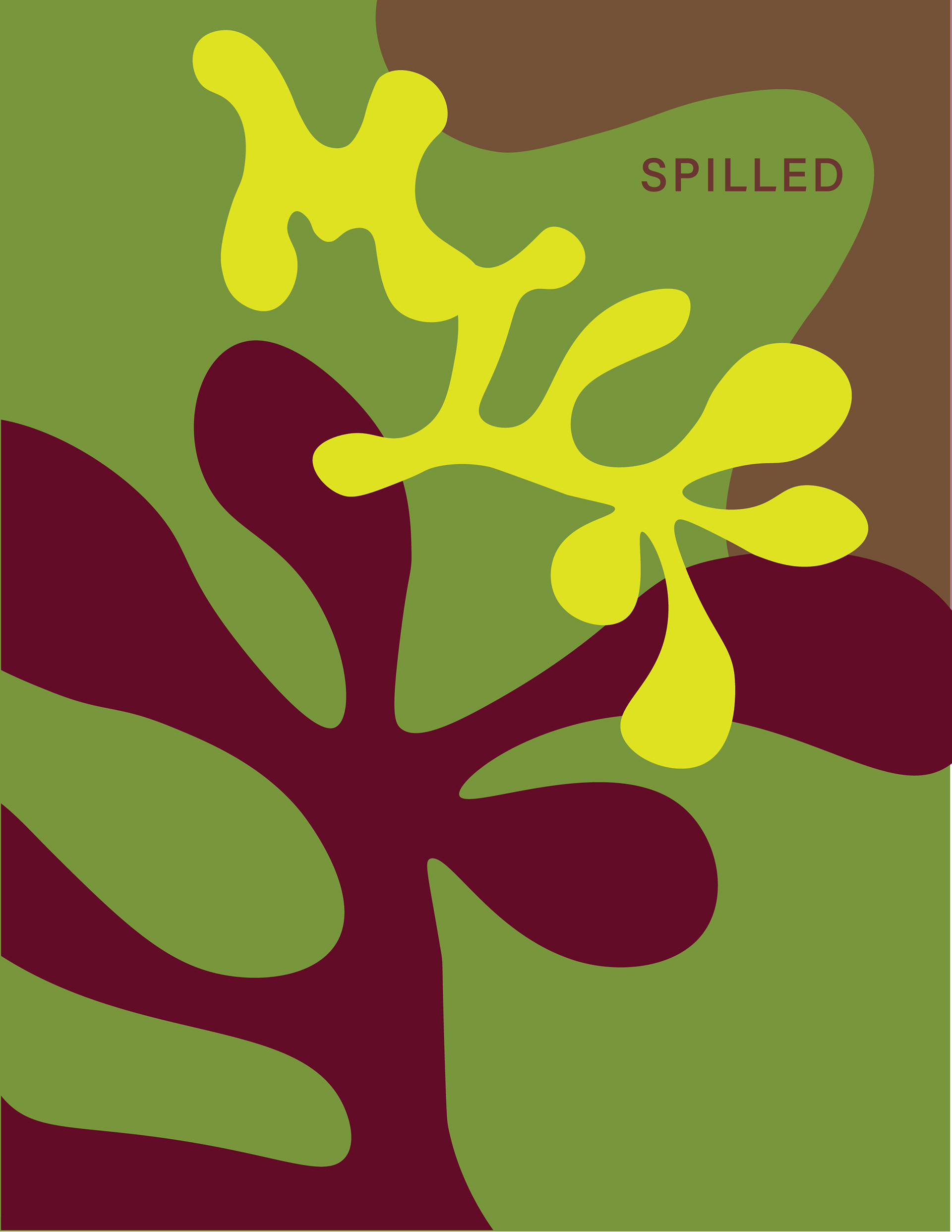
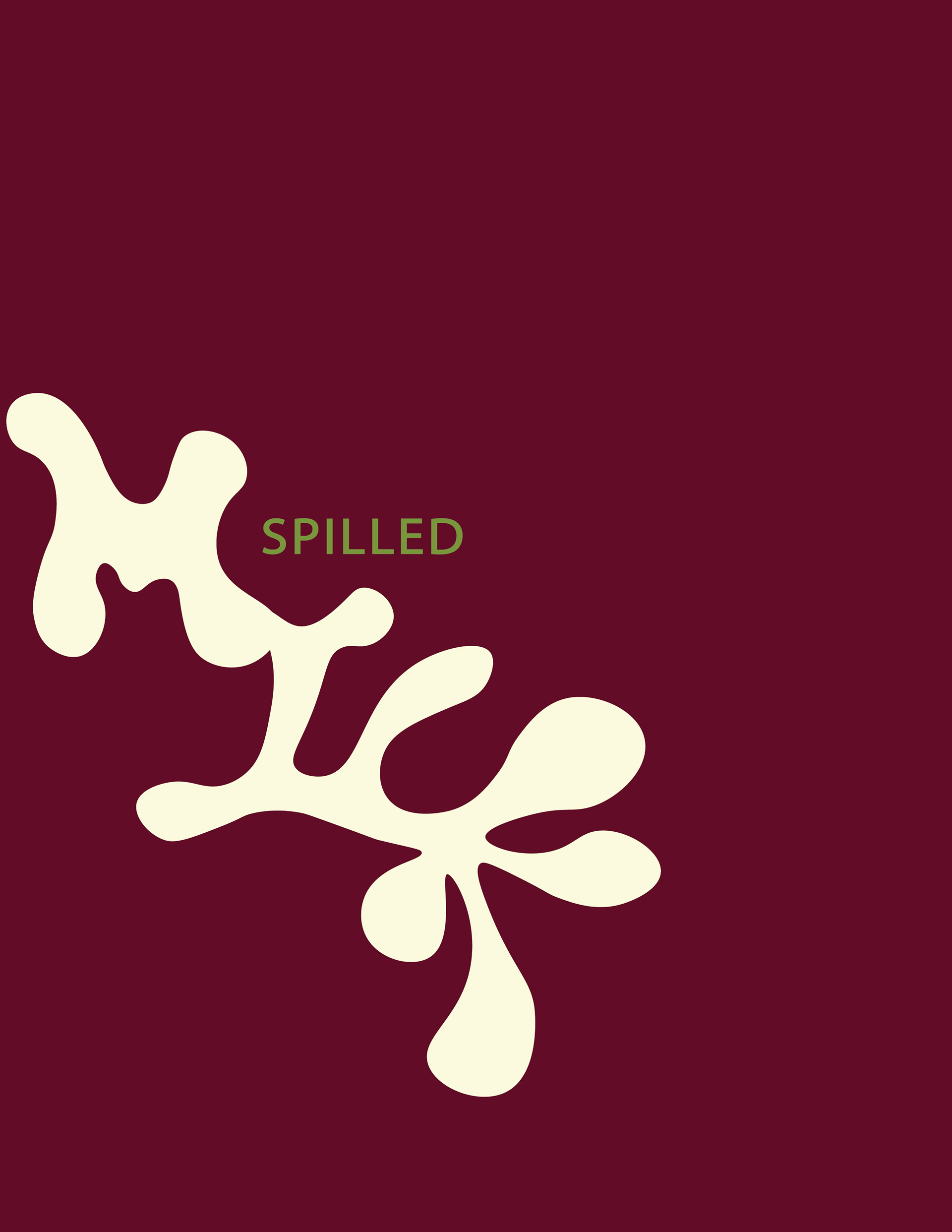
Final Logo
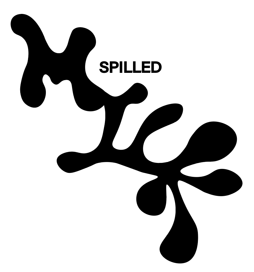
for the final logos, I took the earlier iterations and used more contrast to help improve the legibility of the word. for one of the wordmarks, I wanted the word 'spilled' to appear to have an actual spill on it. To achieve this, I layered 'spilled' into the milk and created a contrast that smoothly linked the two.
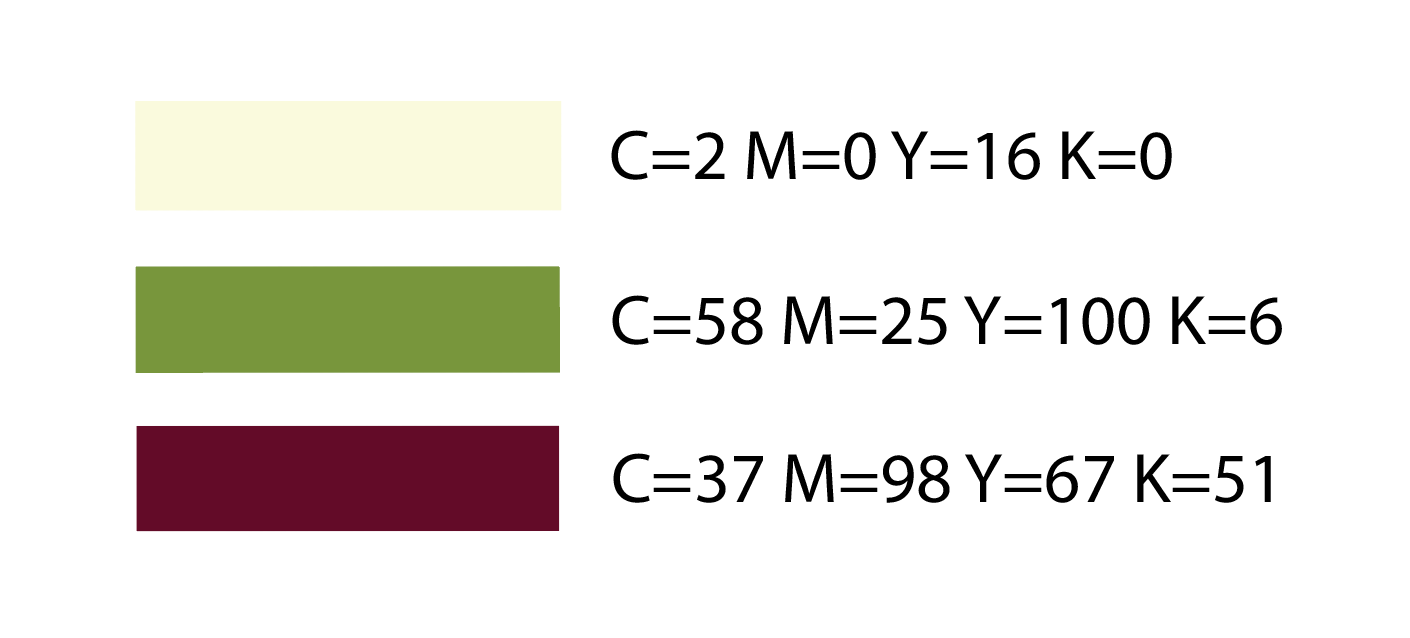
Color Scheme
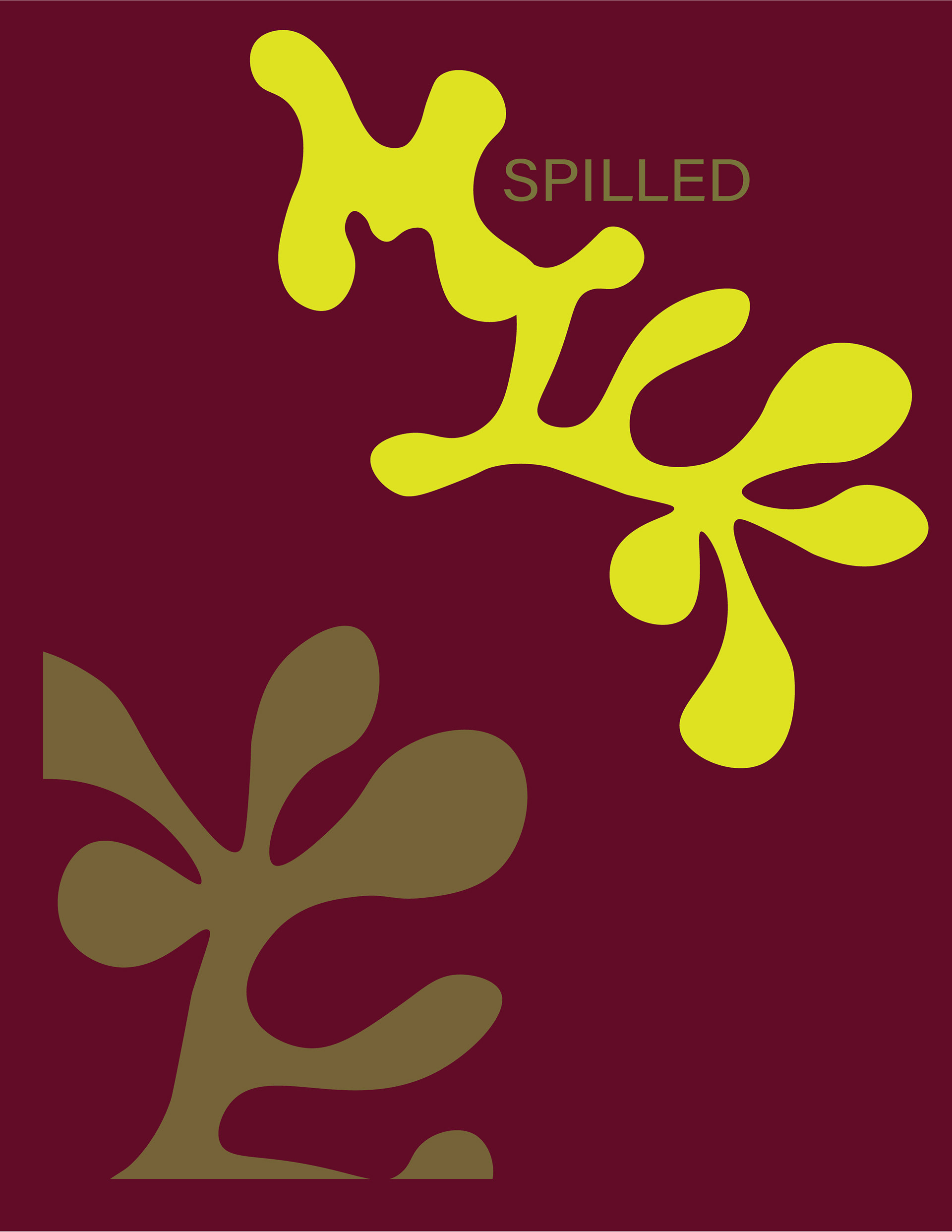
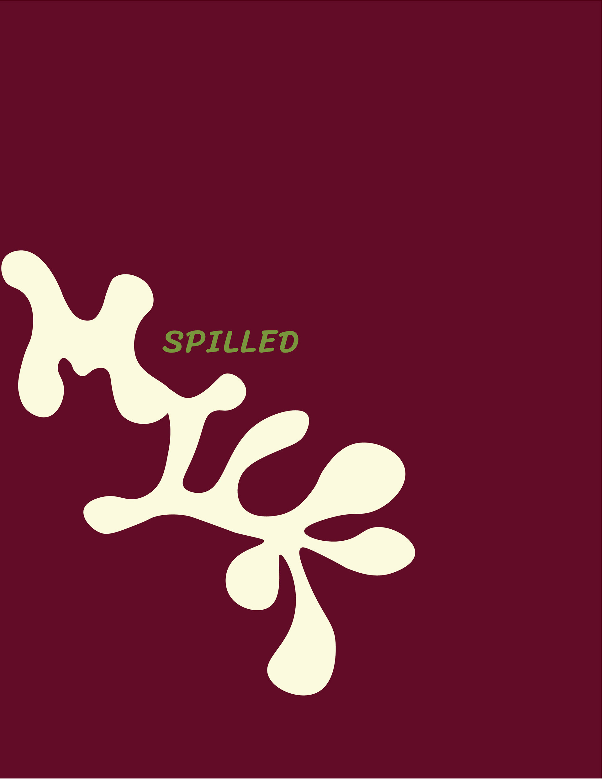
Logo + Color
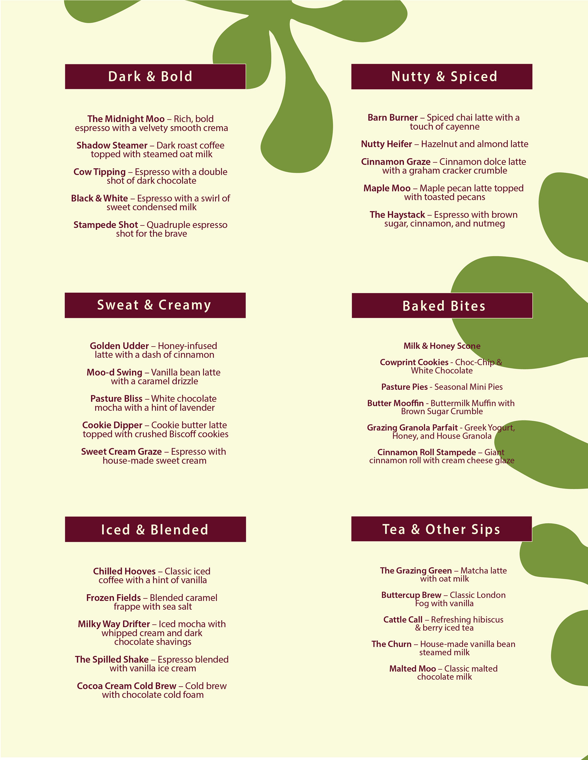
Menu Designs
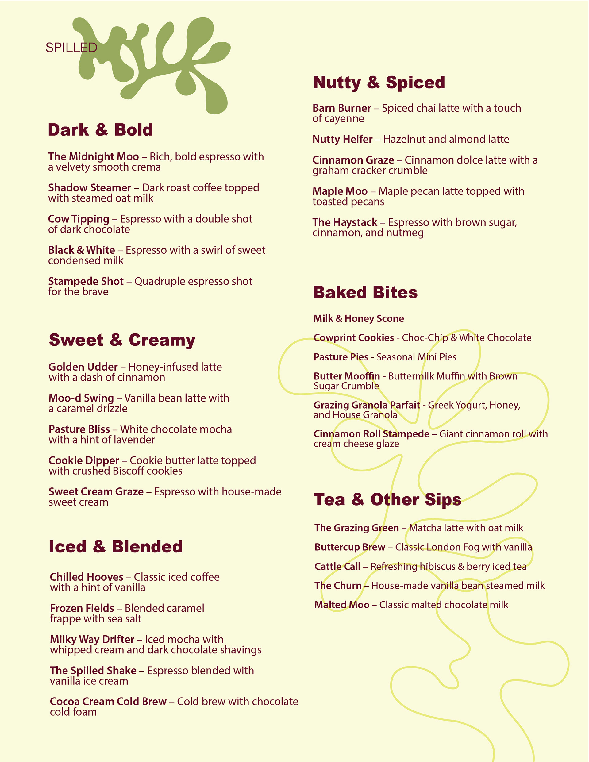
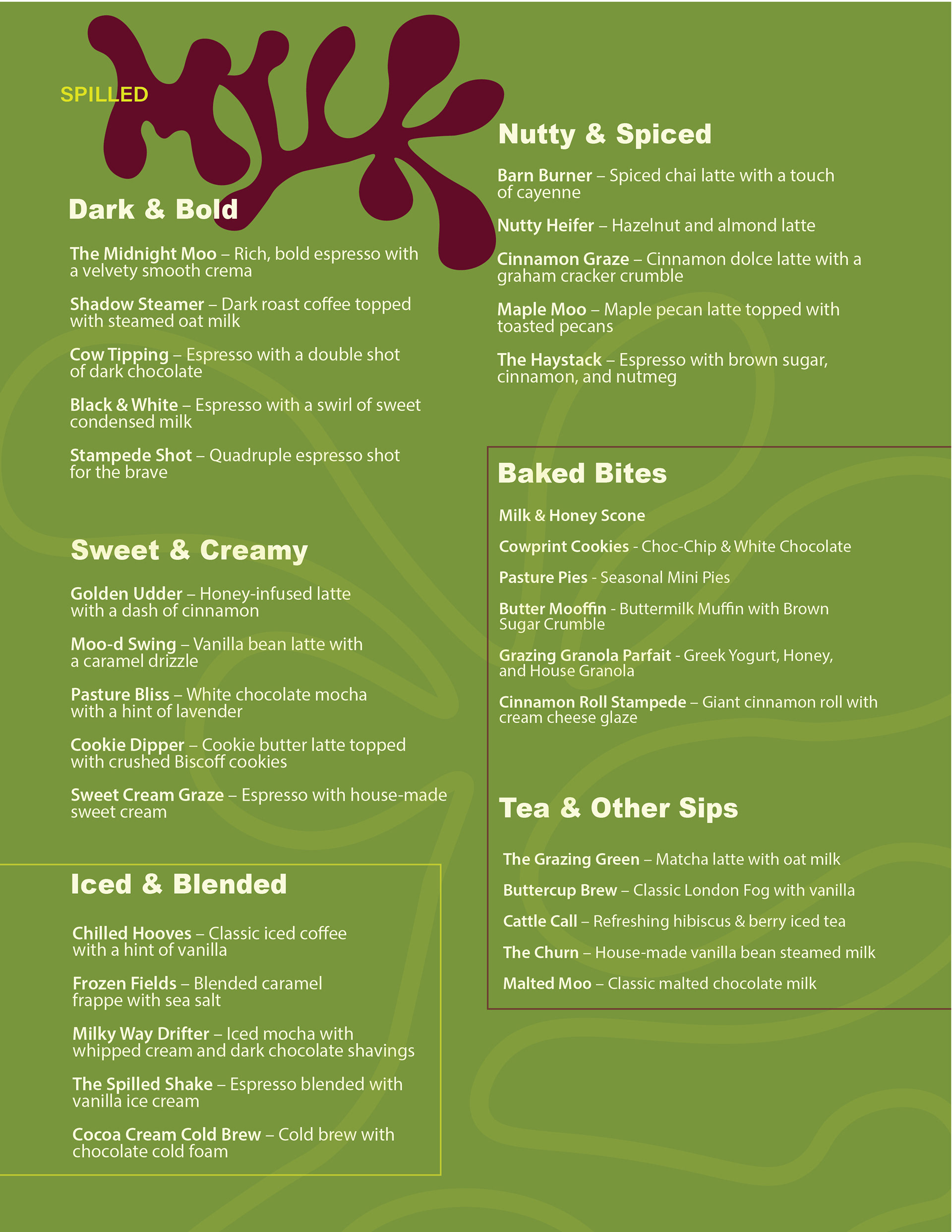
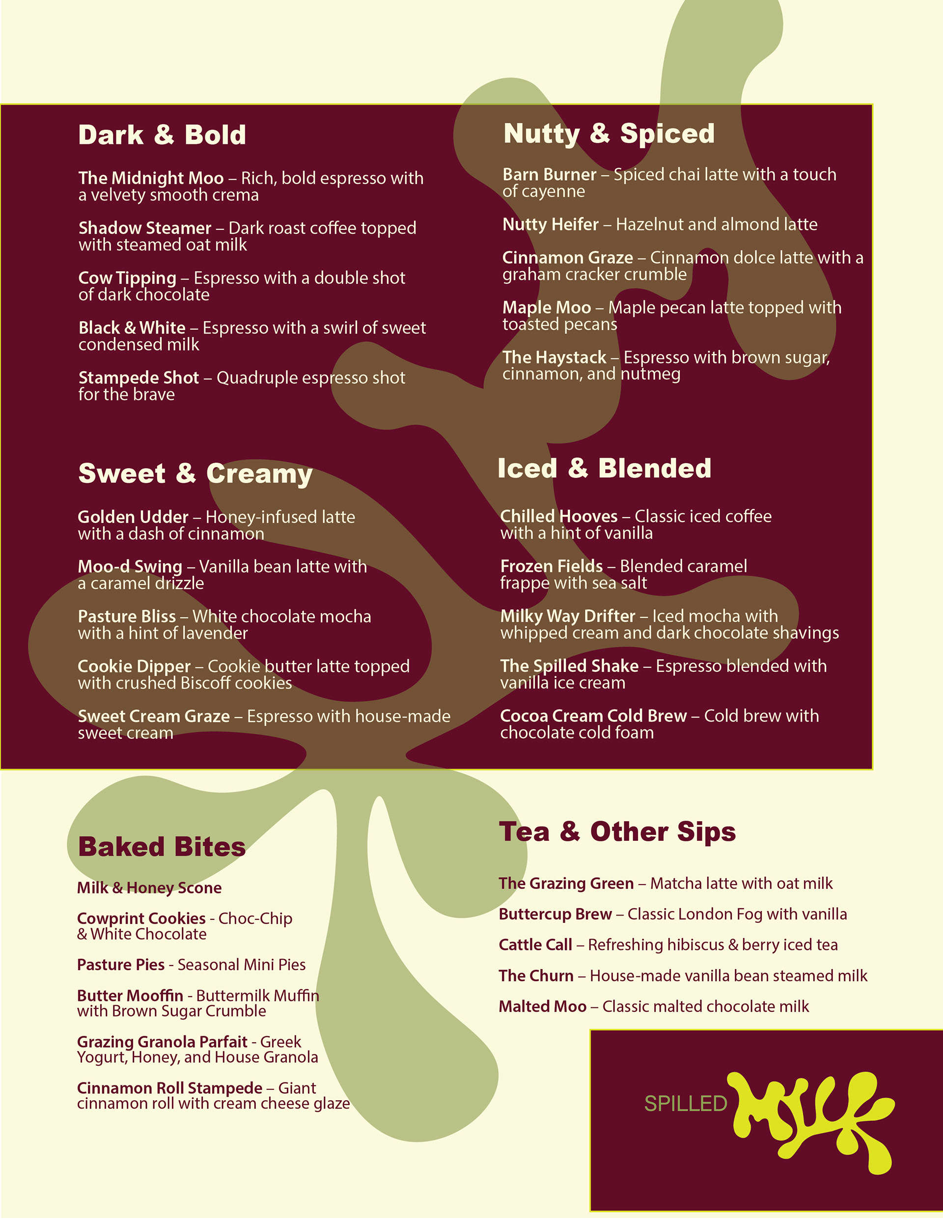
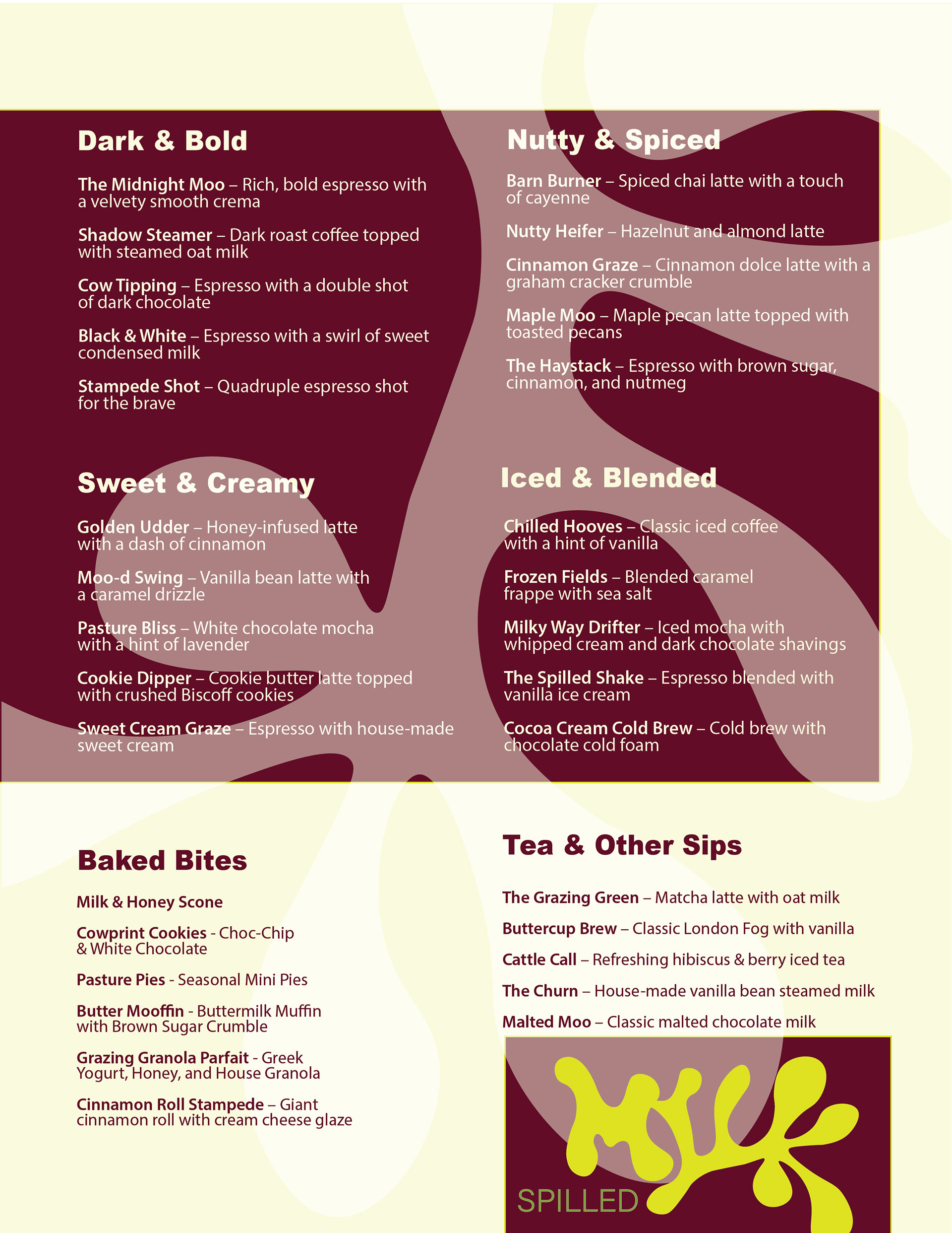
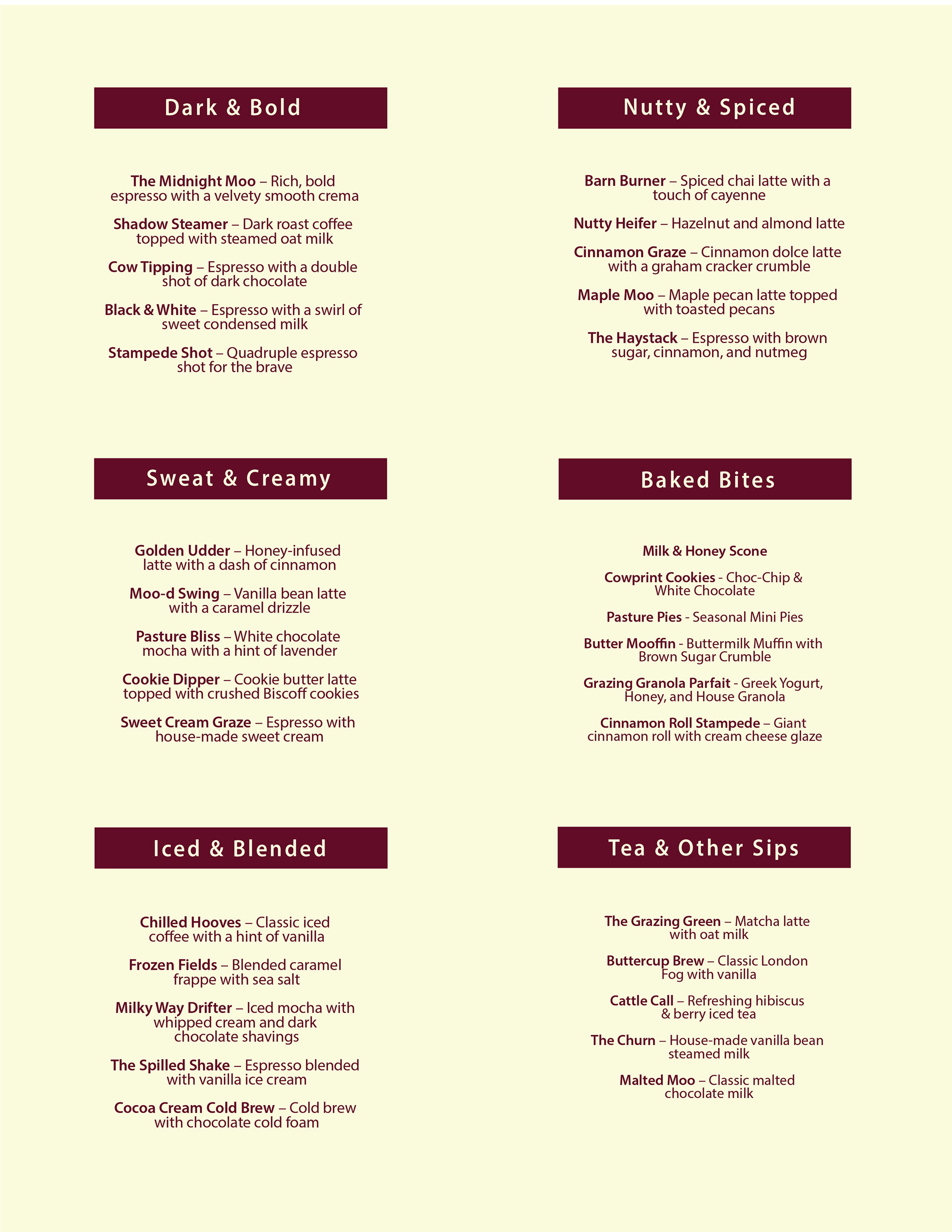
Final Menu
Application Photos