During my 2024 typography 2 course, our final project was to design a poster series for 3 artists covering a similar theme. I chose Poetic Soundscapes with Patti Smith, JJJJJerome Ellis, and Charmaine Lee.


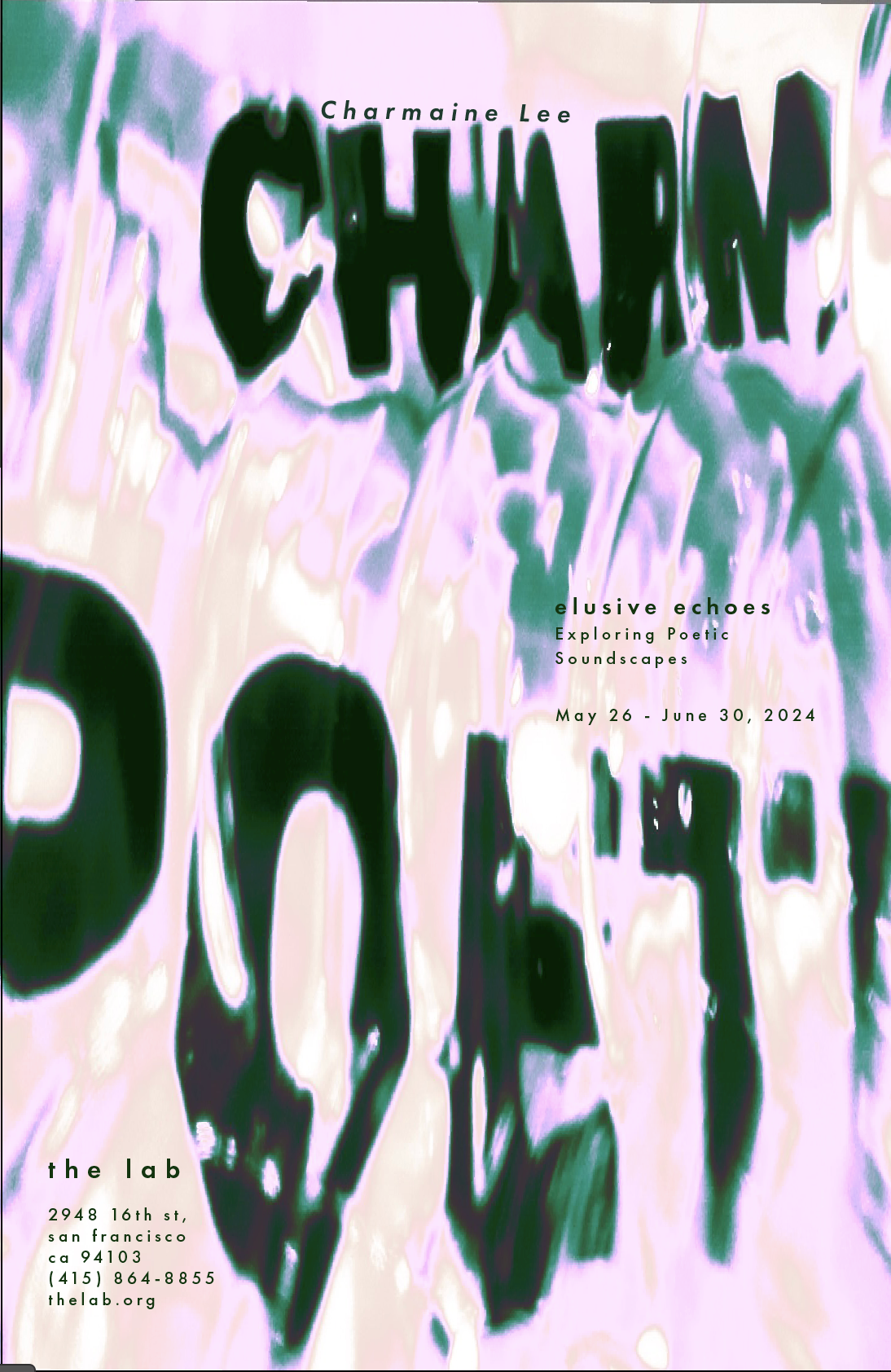
The final compositions featured about were created through a process of photography and editing. I started by printing out the names and phrases I wanted featured in the main frame of the poster using a san-serif typeface. I then distorted the text by photographing it through a crunched up plastic water bottle. I then moved the photos to photoshop and played around with the saturation and hues. I knew I wanted to maintain a secondary color palette throughout, highlighting a different hue in each piece.
The Process
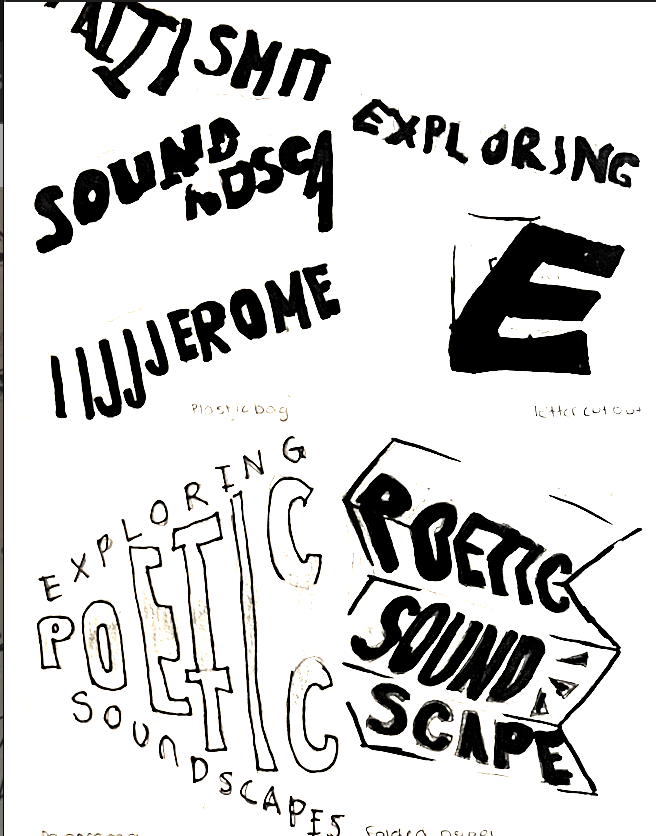
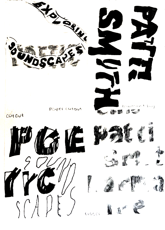
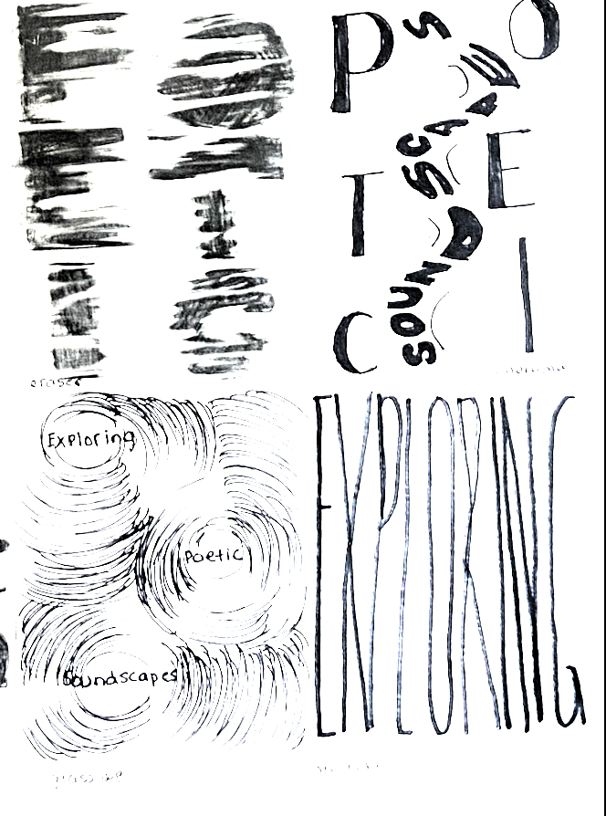
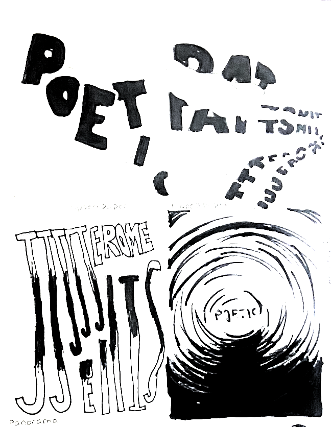
In order to visualize how I wanted my final composition would look, I started by making rough sketched of possible formats and styles.
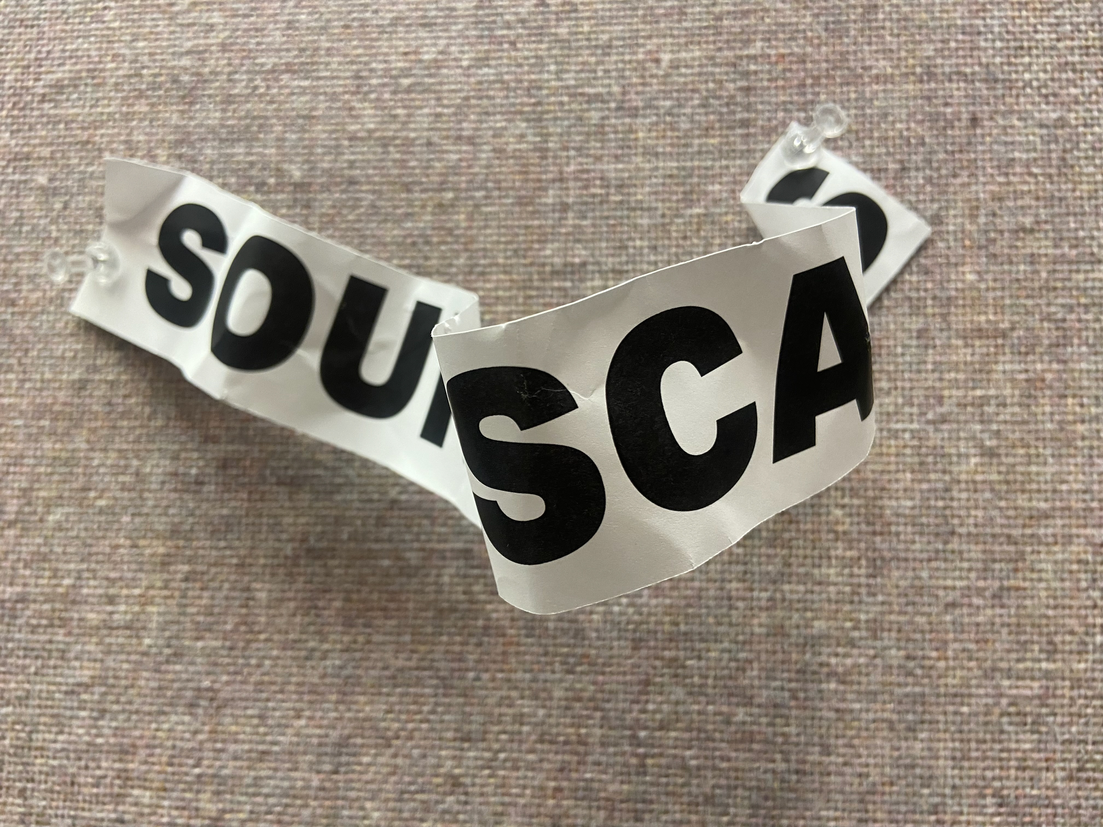
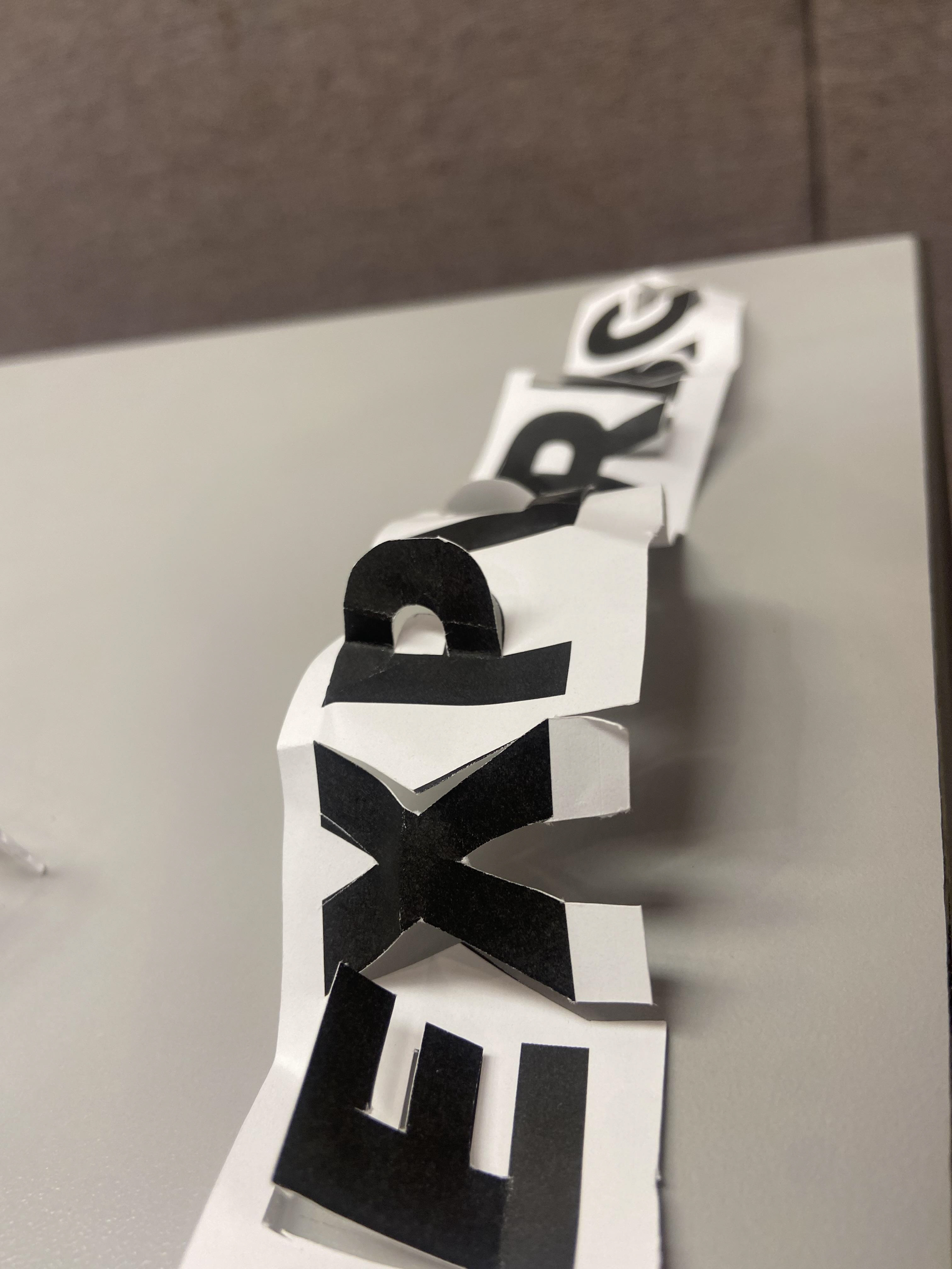
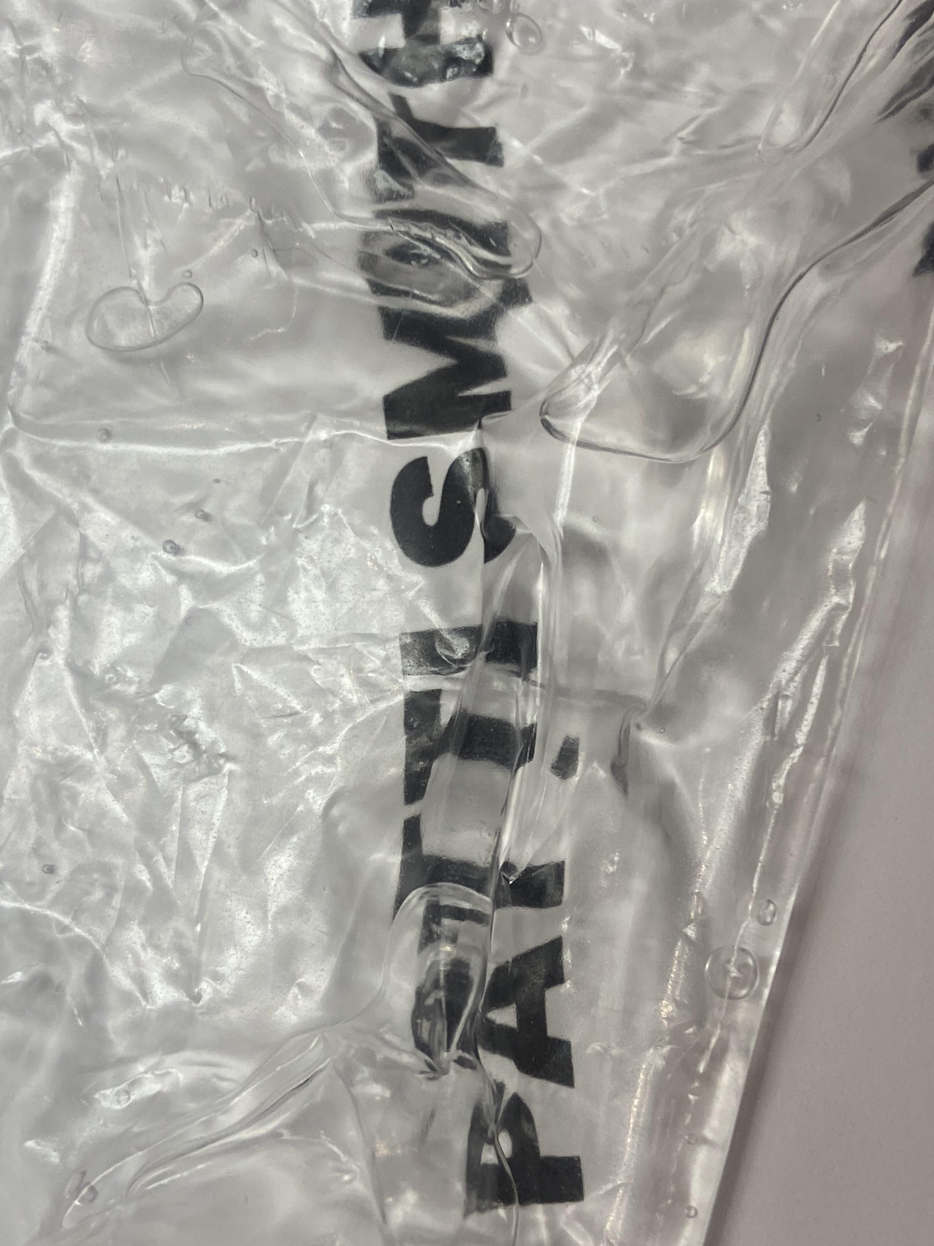
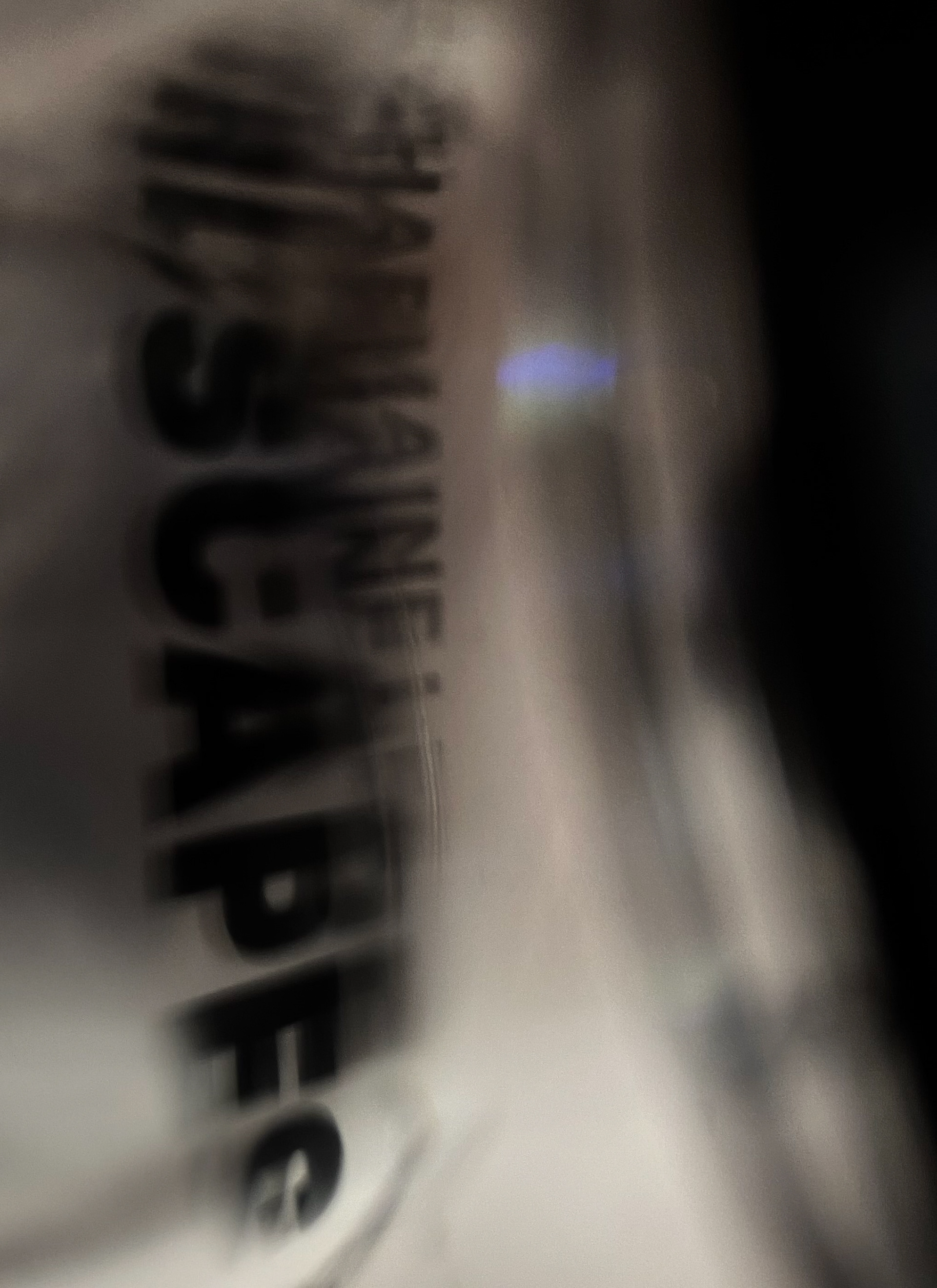
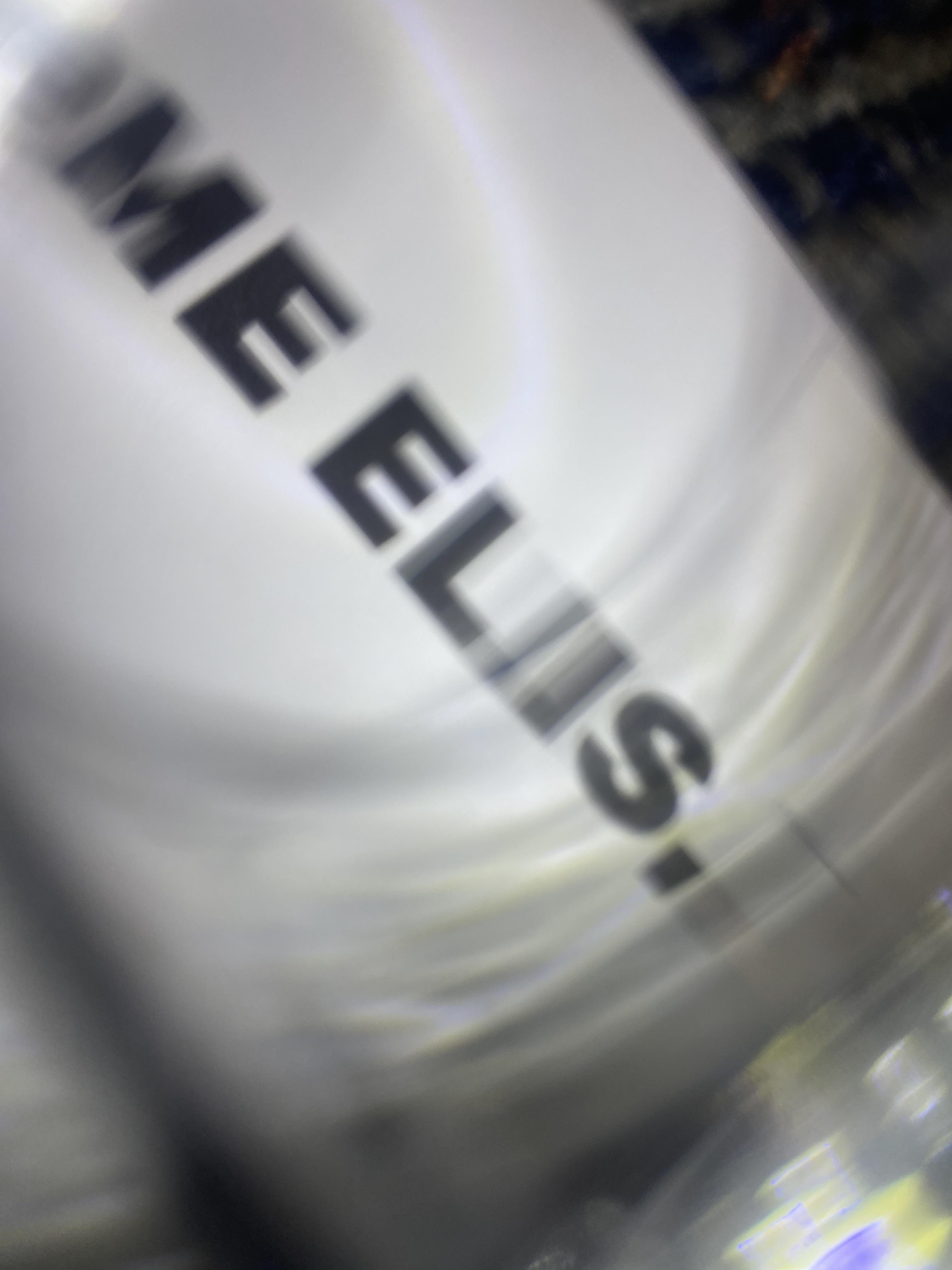
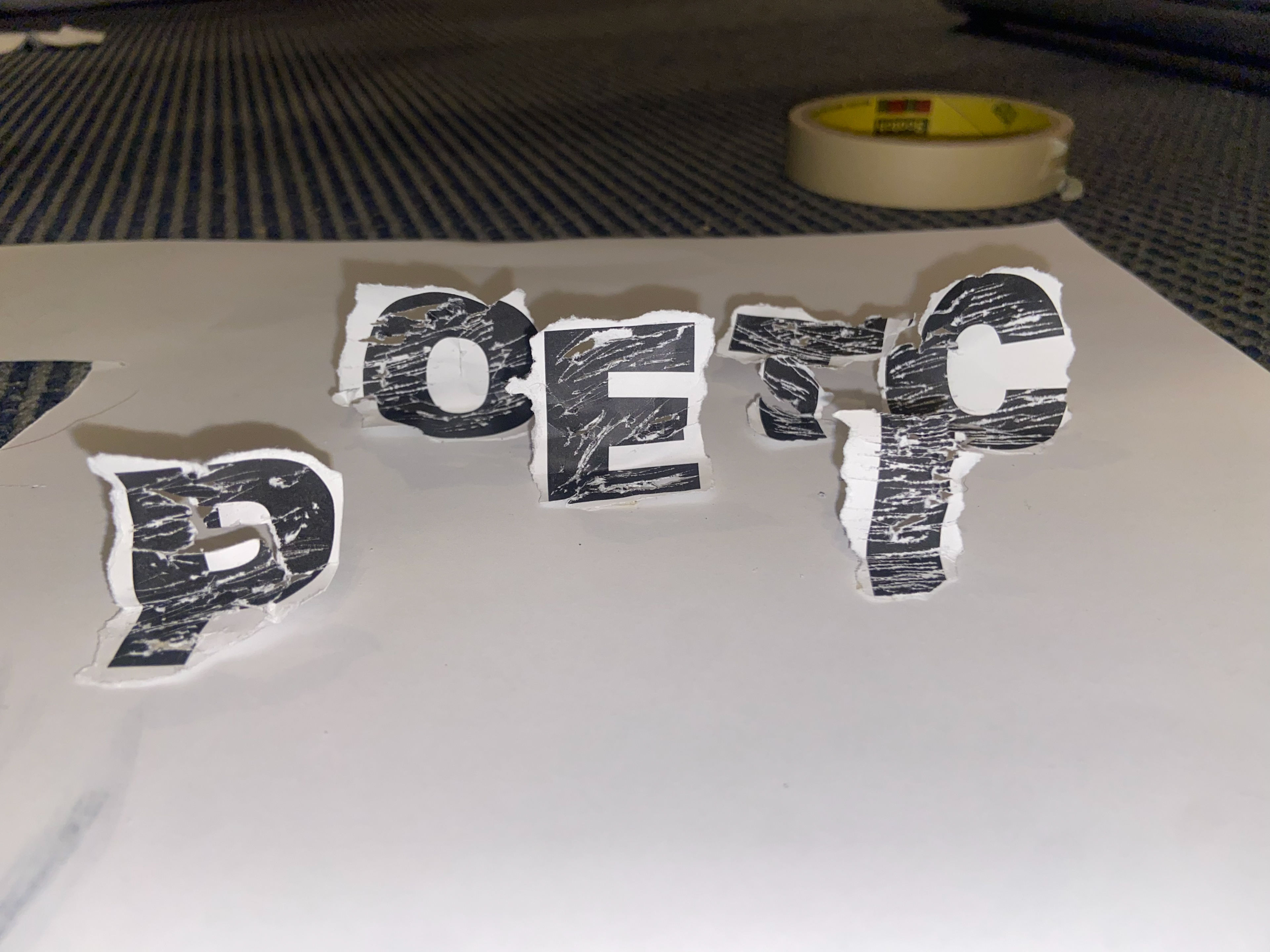
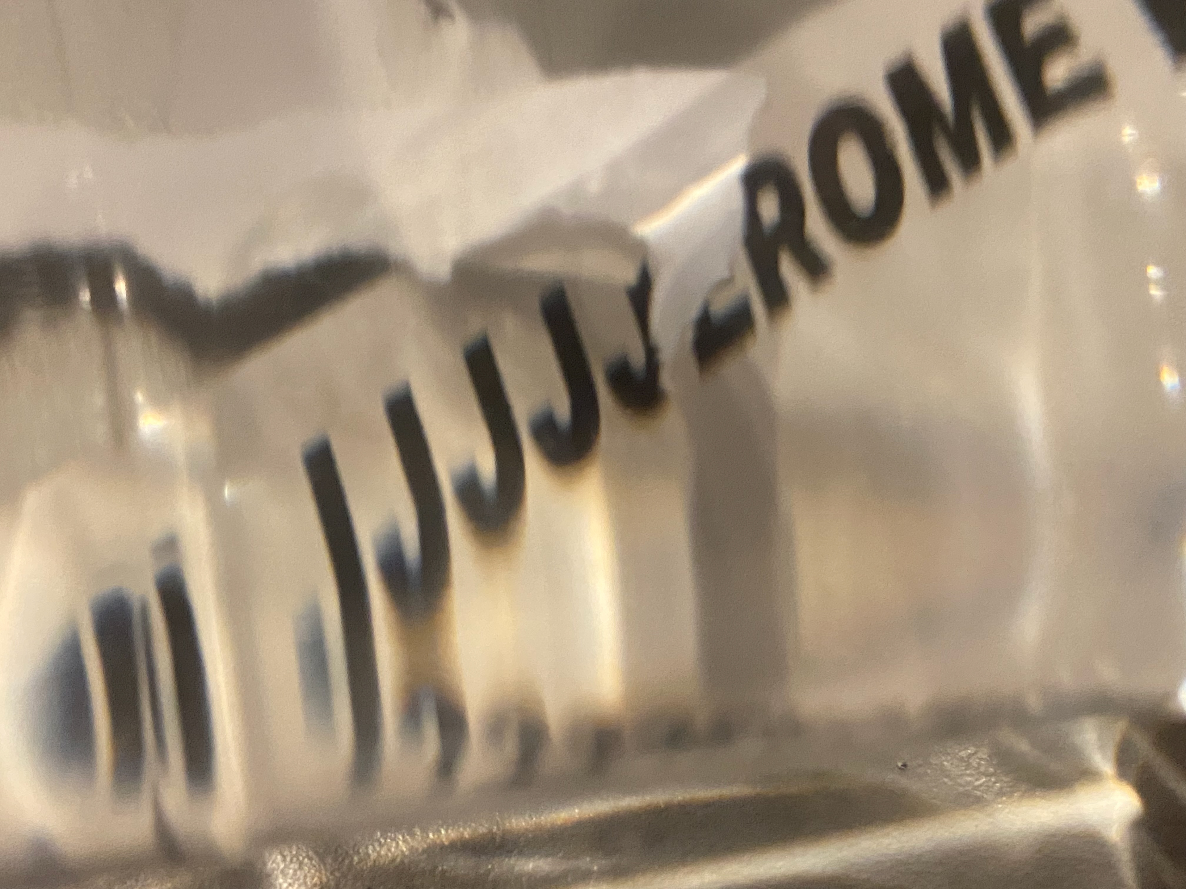
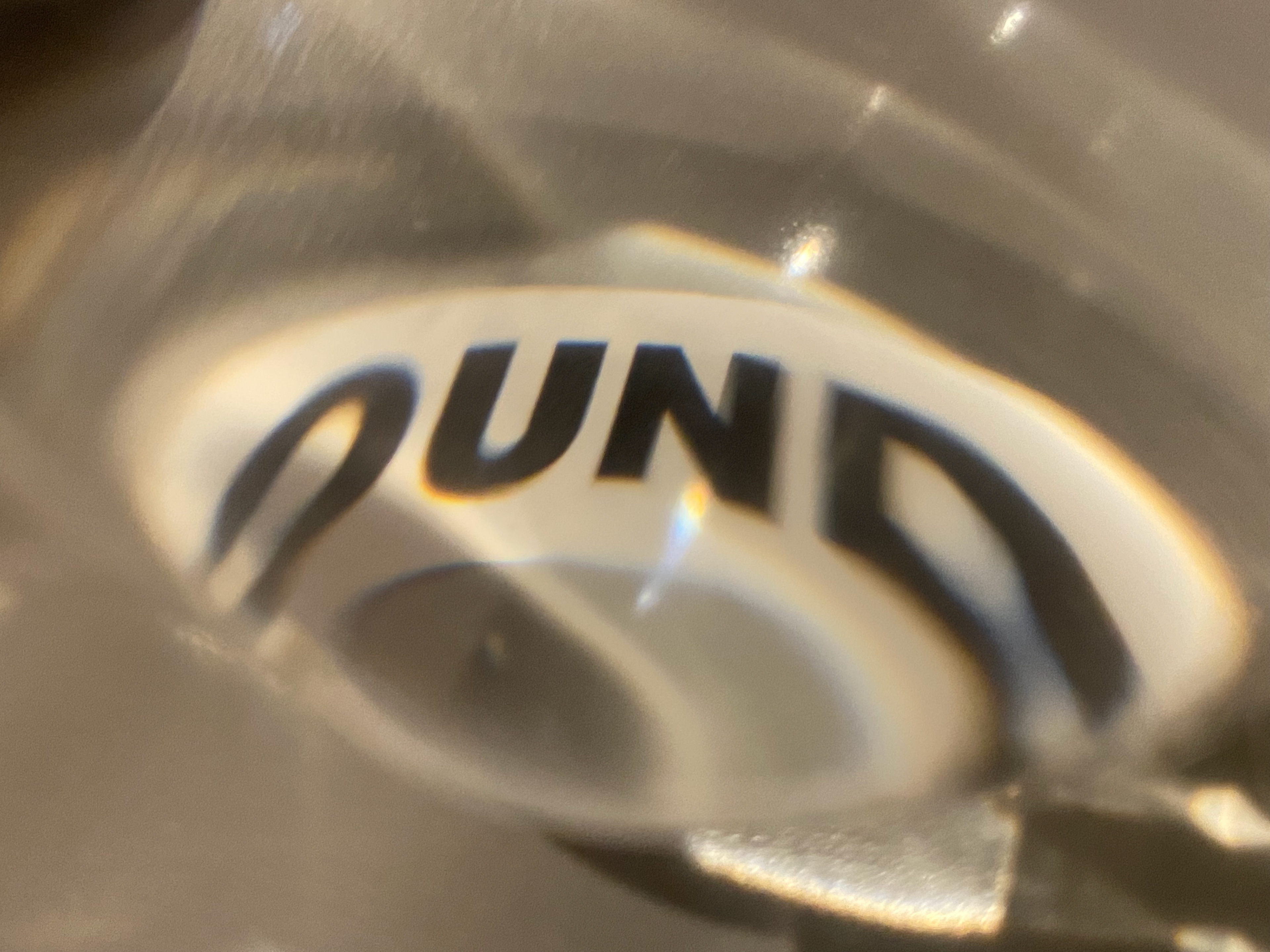
The next stop was experimental. I printed out the words on paper and proceed to play around with different ways of distorting the lettering. I tried folding and cutting to give the words dimension. I also tested distortion using plastic bags filled with water and hand sanitizer, as well as placing glass pieces on top of the text.
Starting the Final
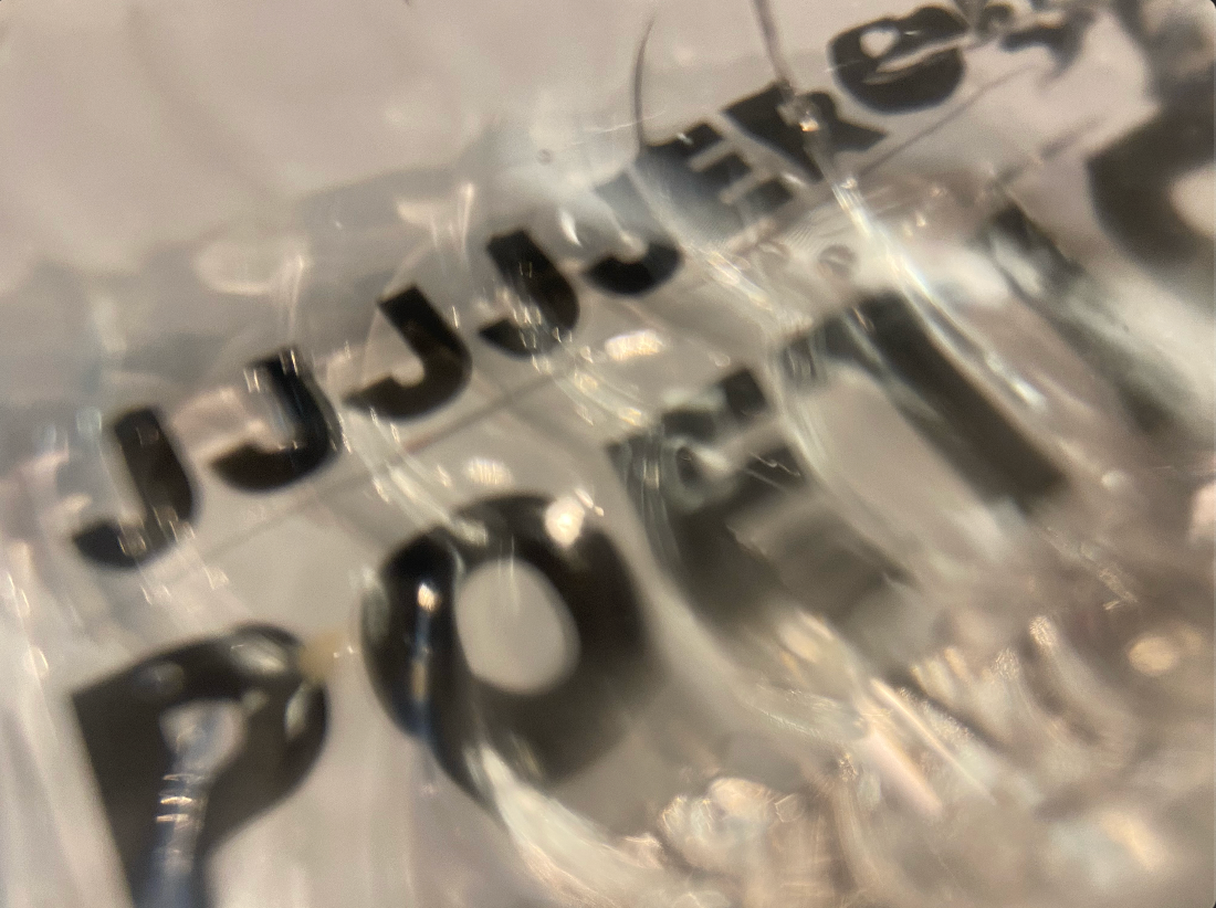
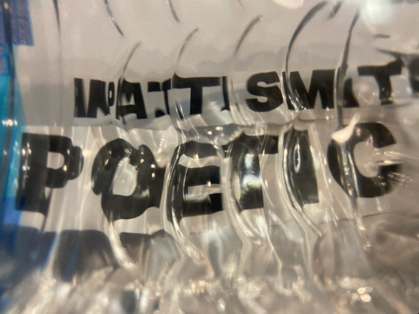
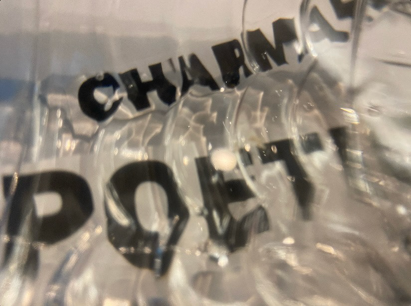
Above are the photos I landed on after a long series of evaluations. A simple water bottle sufficed.
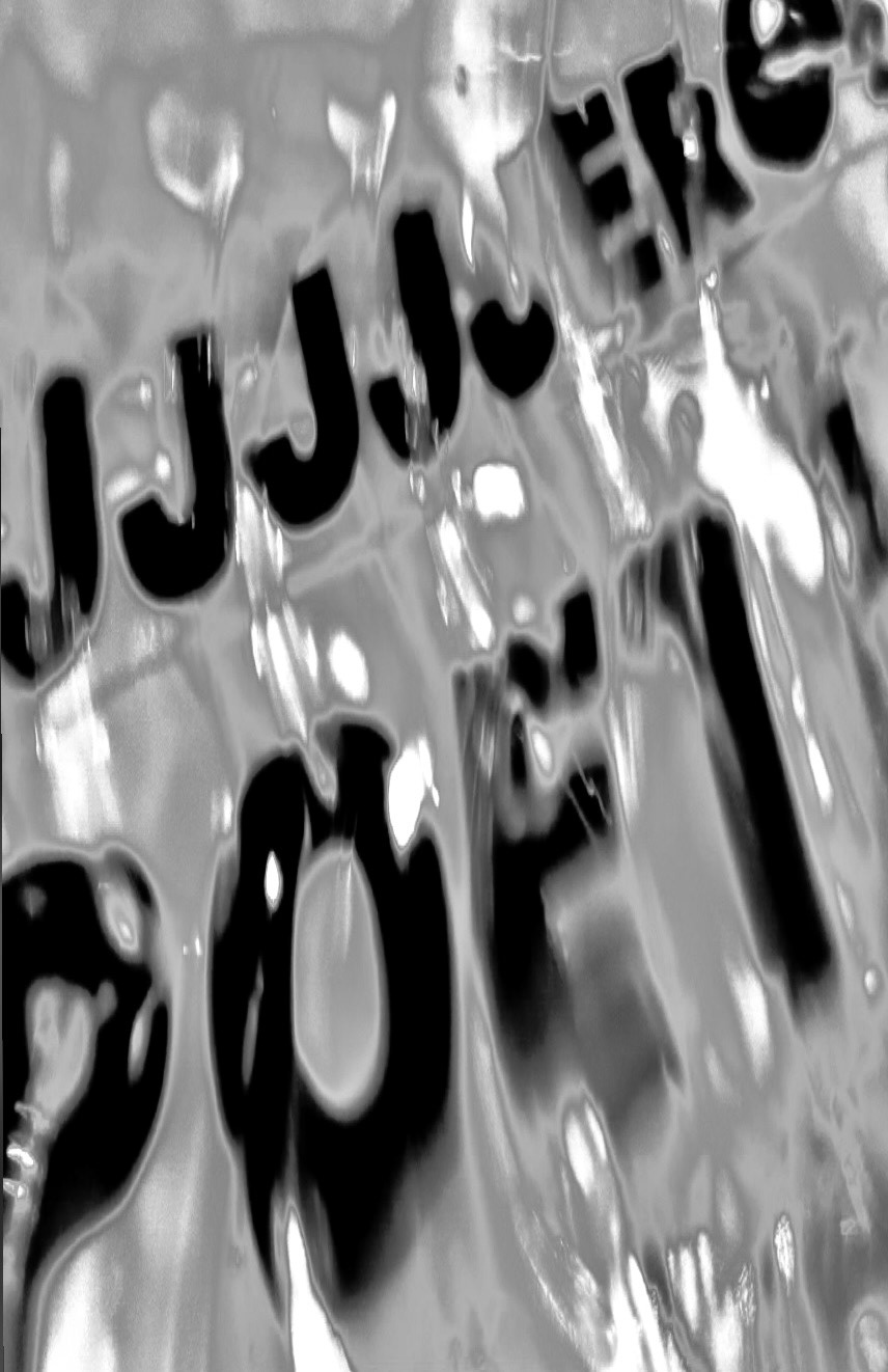
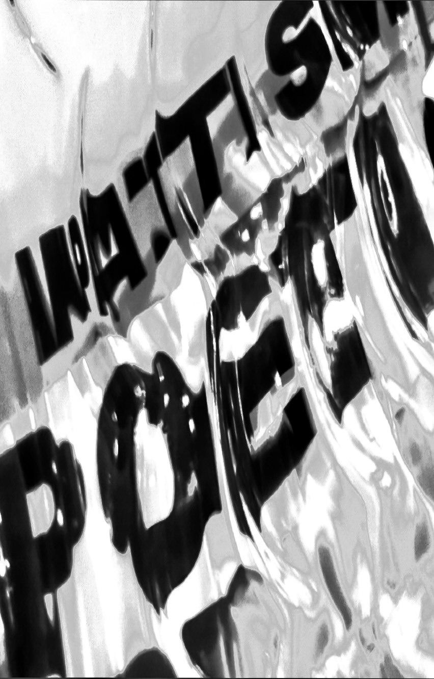
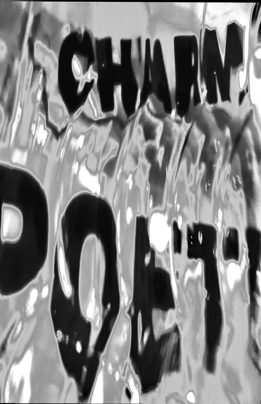
Bringing these photos into photoshop, I cropped them to fit the poster shape and proceeded to edit. I played around with the light, saturation, and white balance to get clearer image of the textures and texts in the photo.
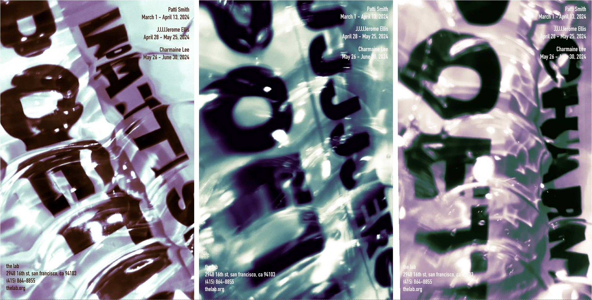
Above are the first iterations using color and bringing in typography. I attempted to maintain the secondary color palette, however the orange didn't peak through with these. The type was too blocky and I felt it interrupted the general flow of the poster.
The Final
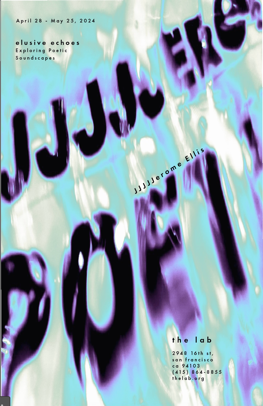
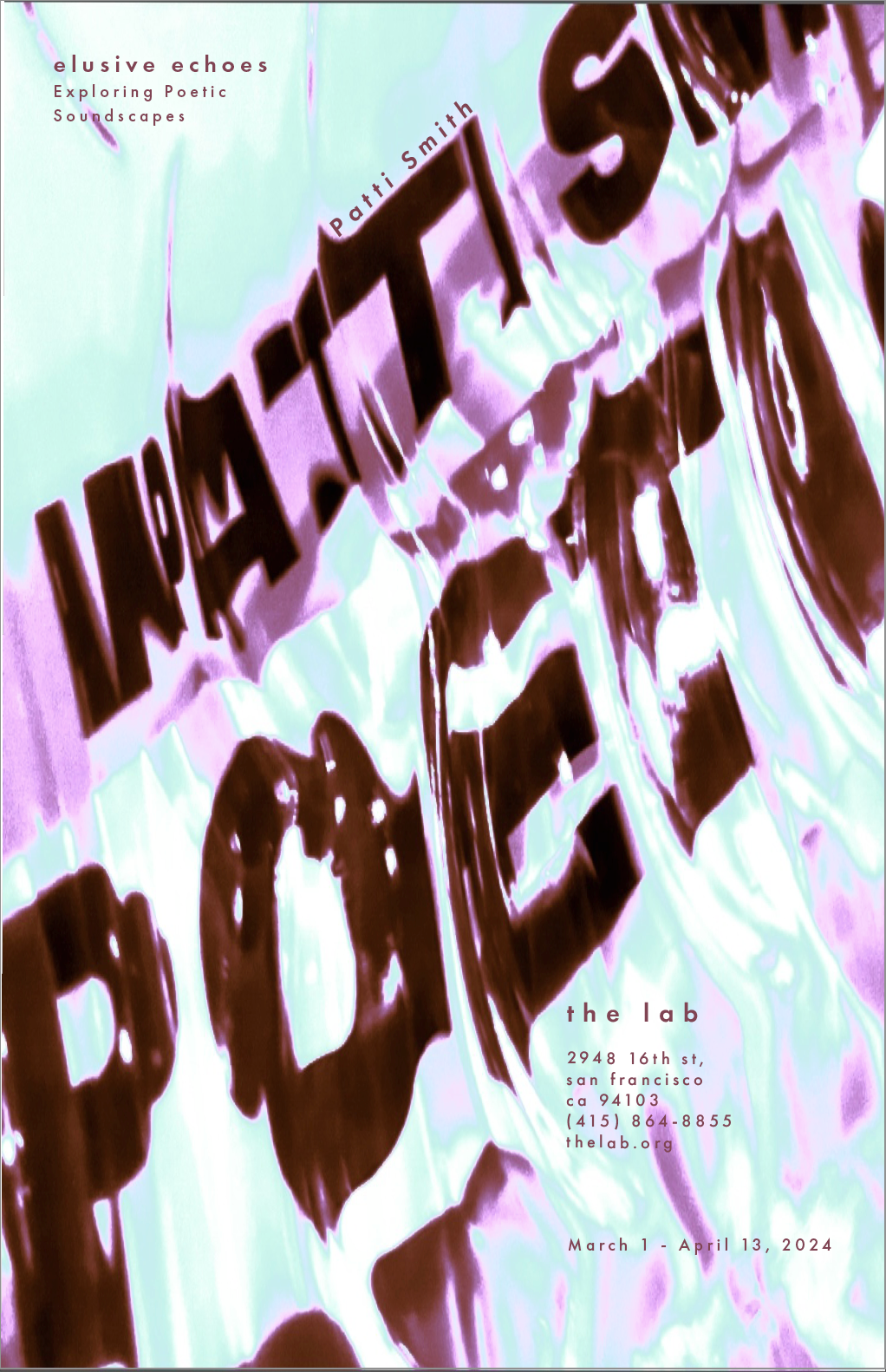

In the final composition I made the hues lighter to allow the colors to pop more. I also switched to a thinner san-serif typeface and kearned the lettering to allow the text to blend more seamlessly. Through this process I learned the importance of patience and the value in each little step. I am very proud of my final and the skills that came with designing it.

