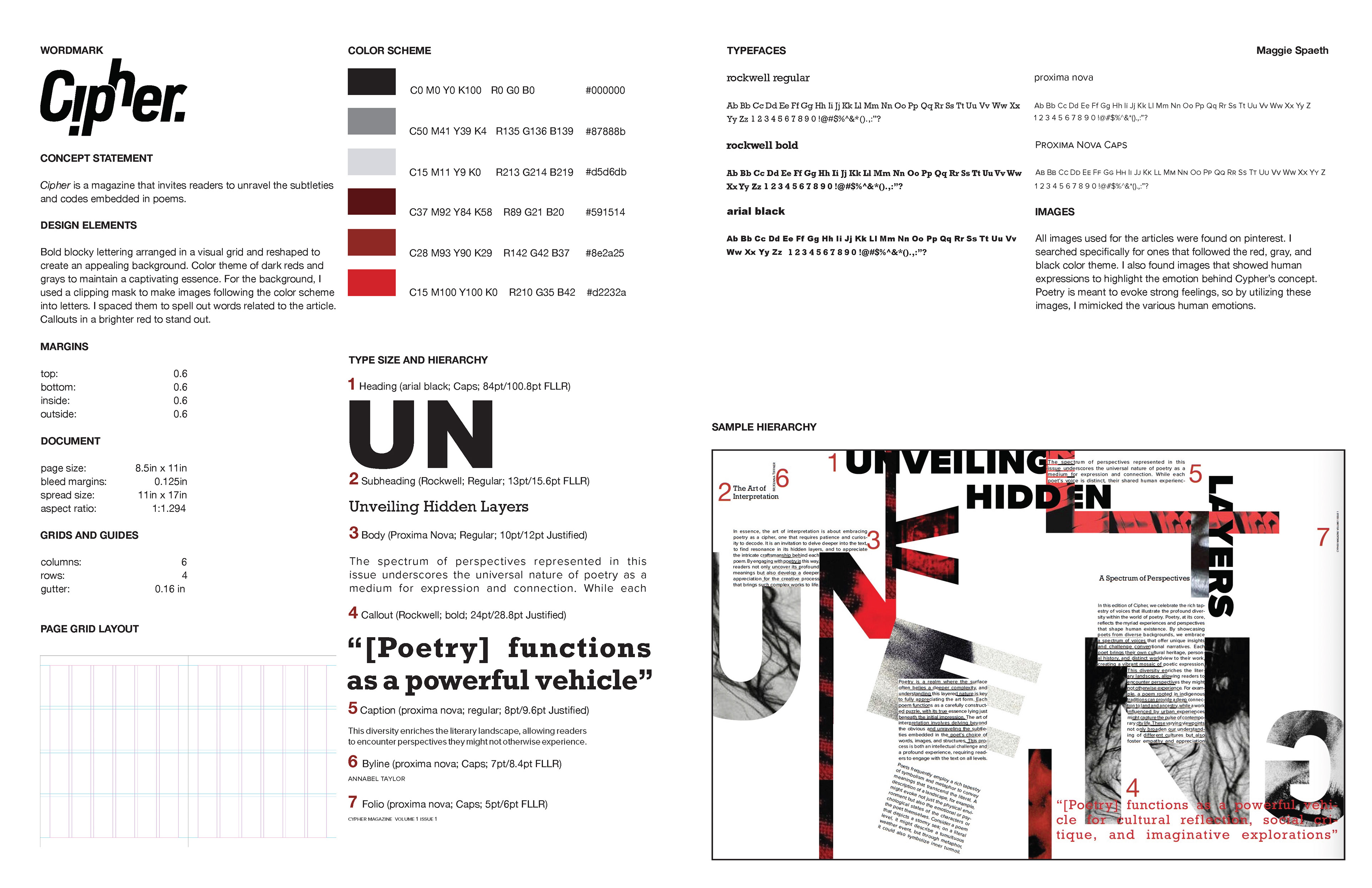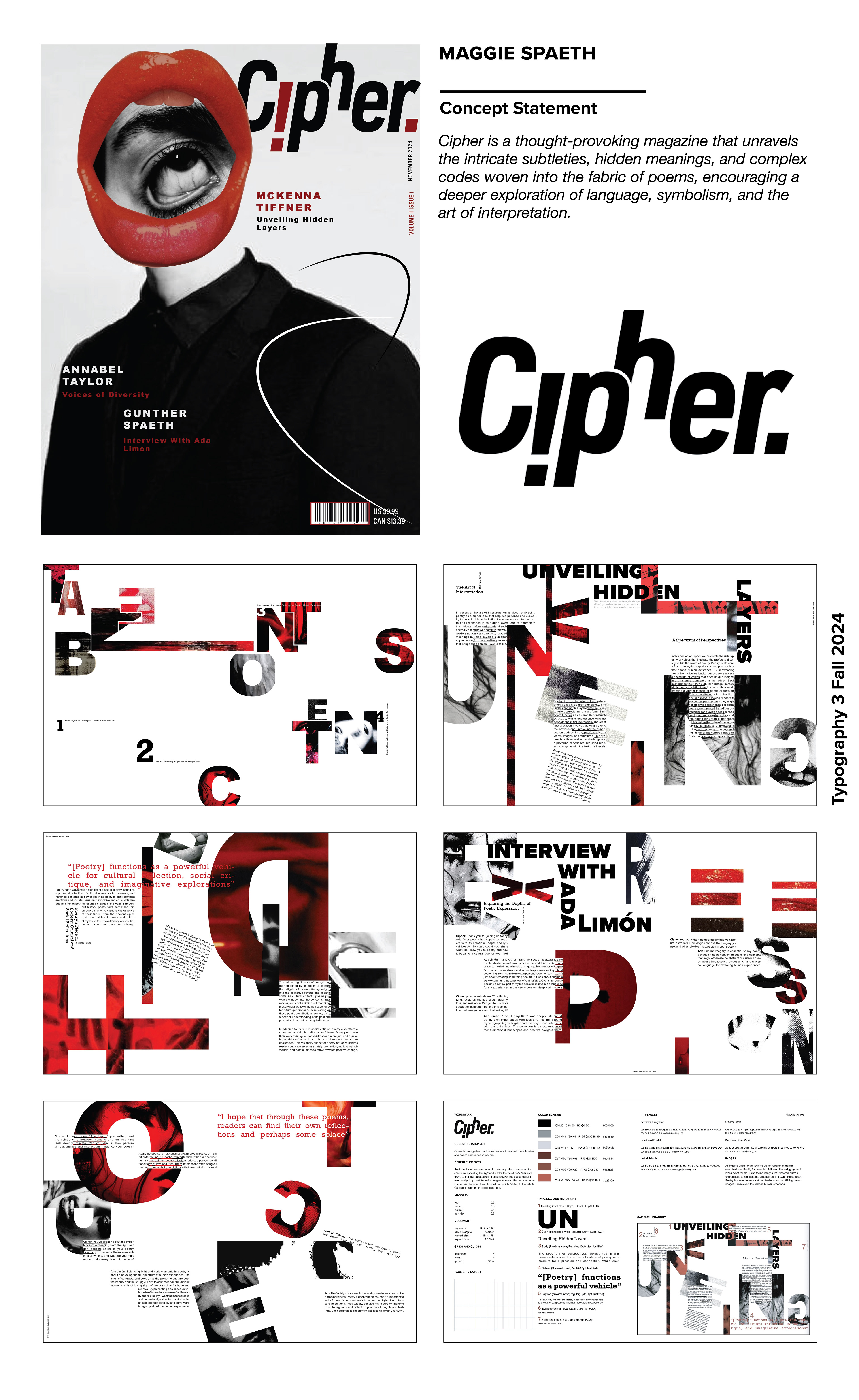
Cipher is a publication I designed in my Typography 3 course. It's purpose is to explore the deeper meaning behind poetry in a bold, modern way. Using a strong color palette of red, black, and gray, the look is intense and emotional, meant to match the depth of the poems inside.
Wordmark iterations
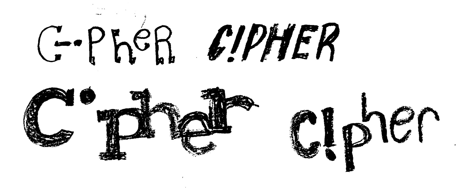


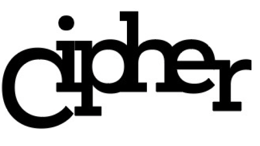


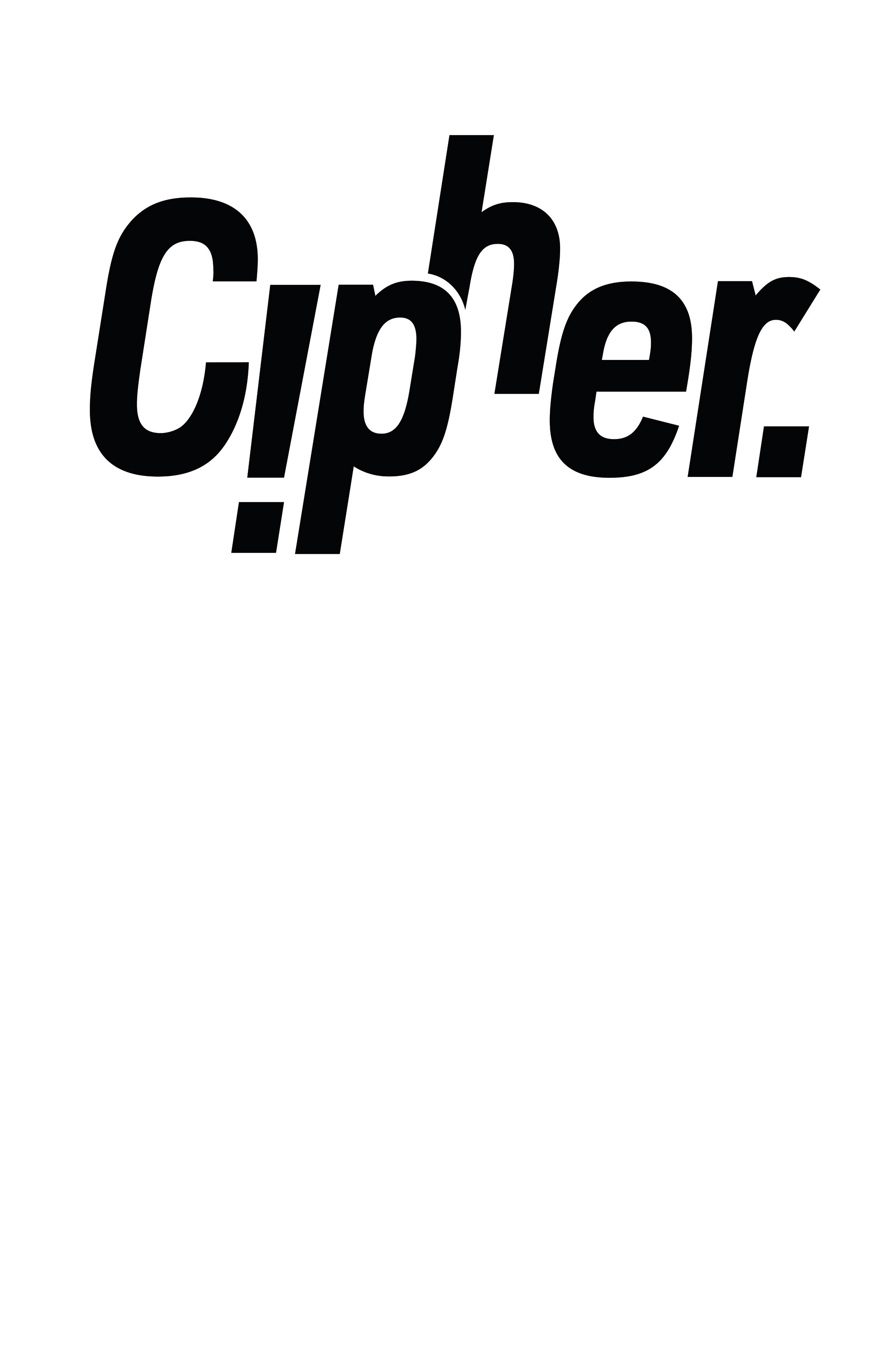
I wanted my wordmark to be bold and captivating. My earliest iterations used serif fonts, but I switched to a san-serif because I felt it was more bold. I made the "i' into an exclamation point to not only give the title intrigue, but to also make a statement about the effect of punctuation in poetry.
Final Wordmark
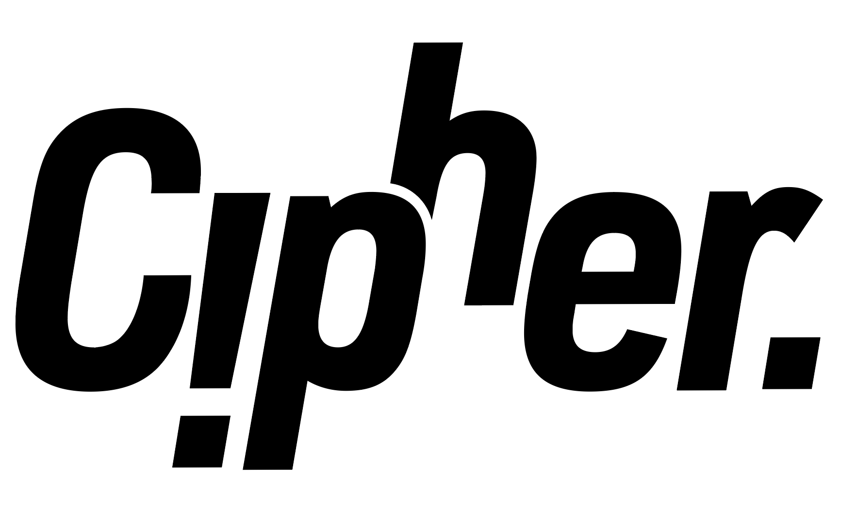
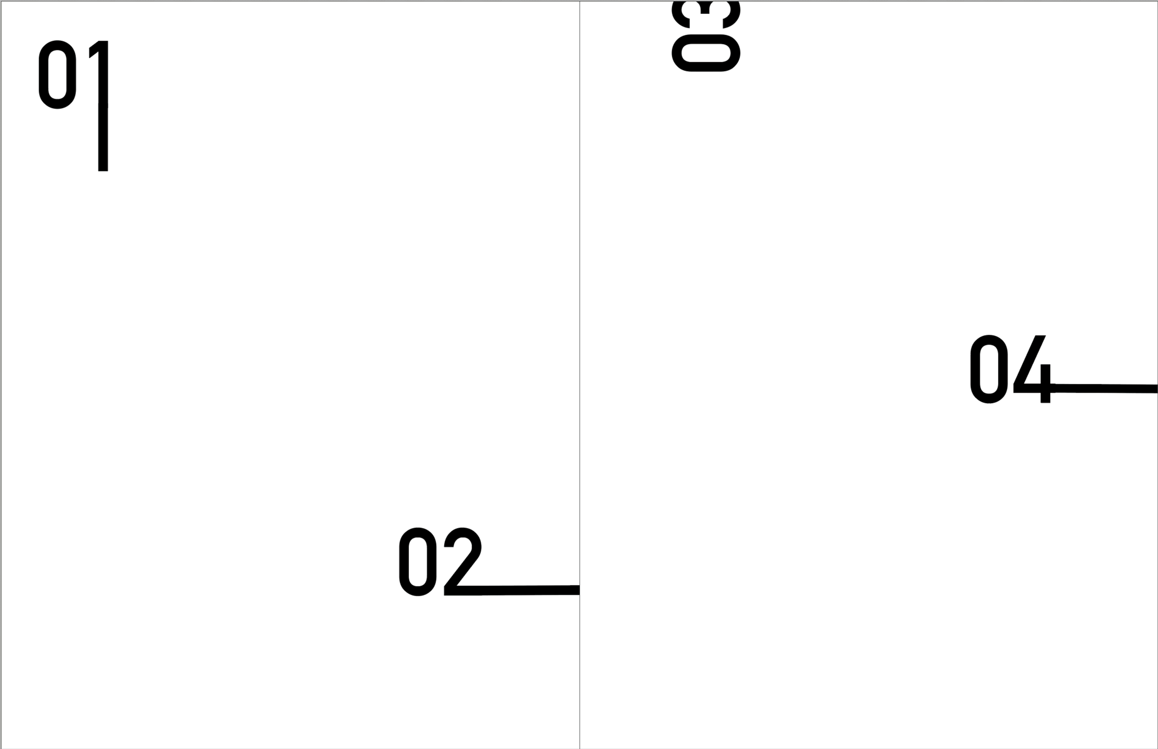
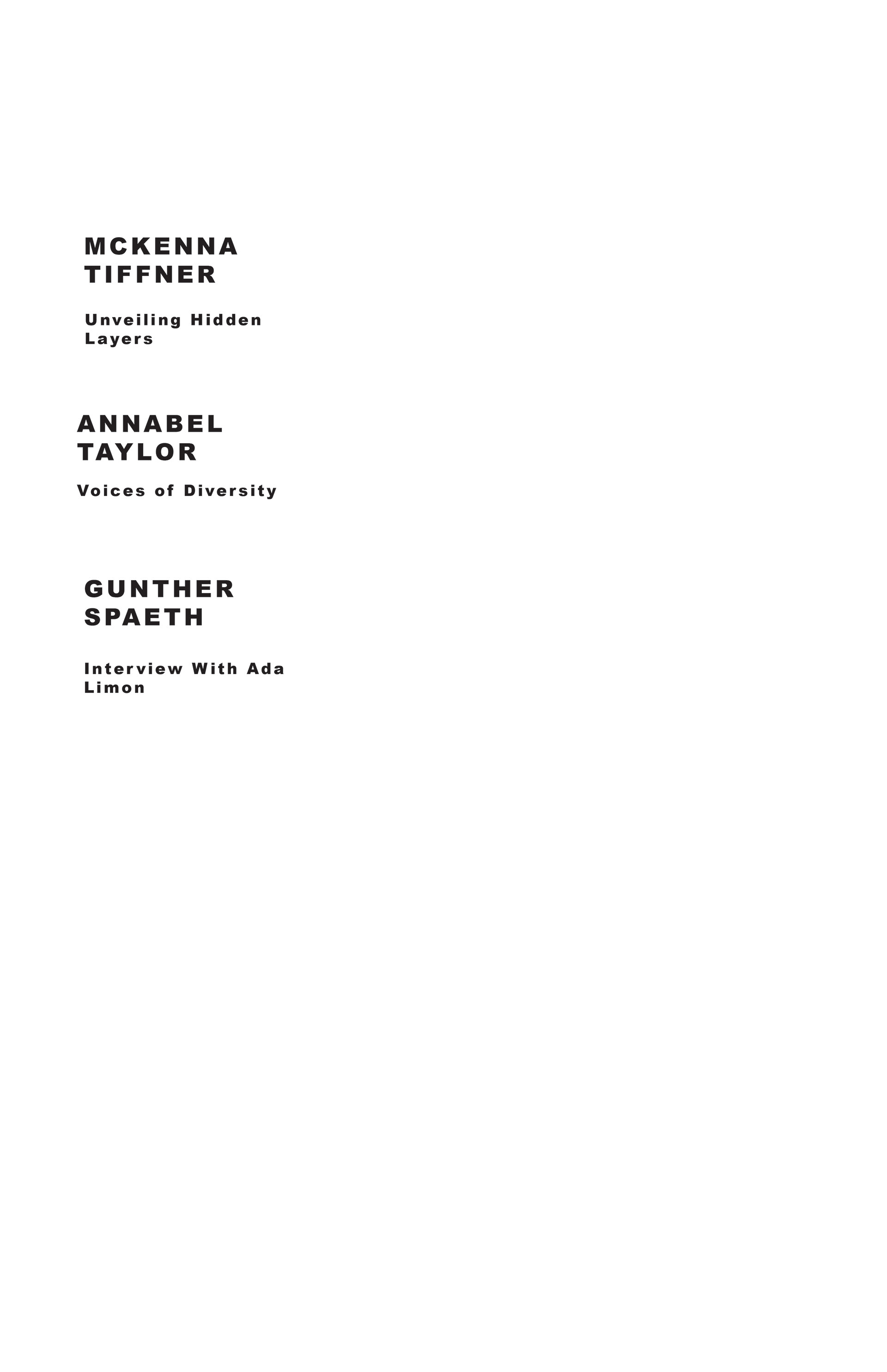
Table of Contents
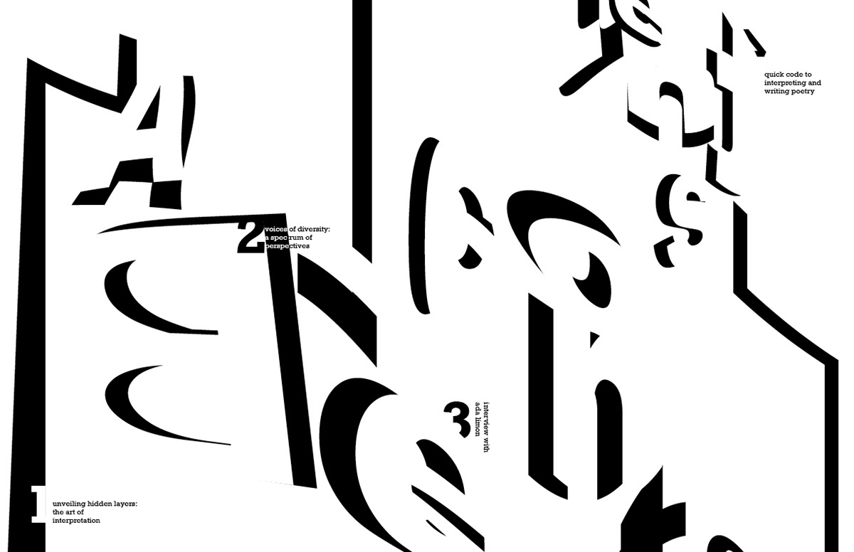
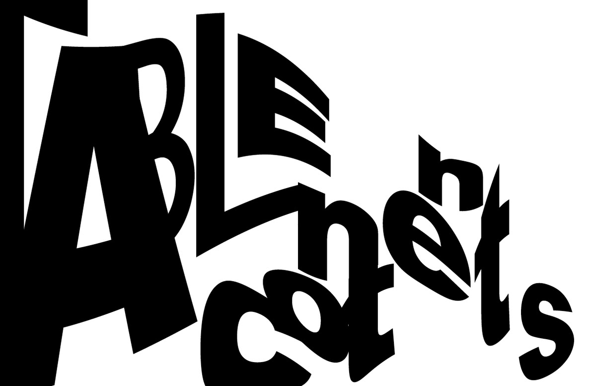
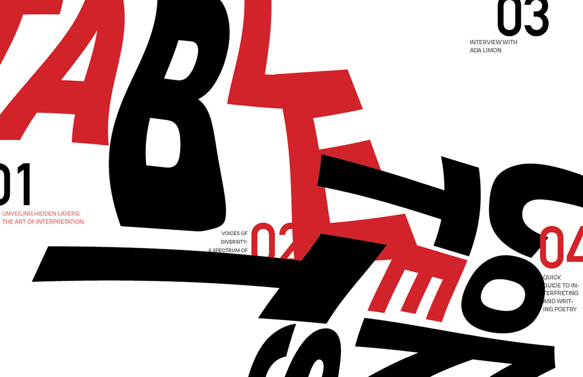
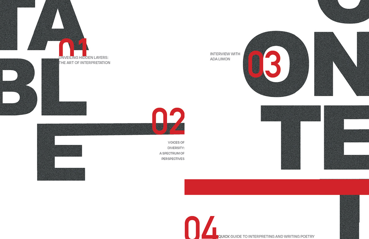
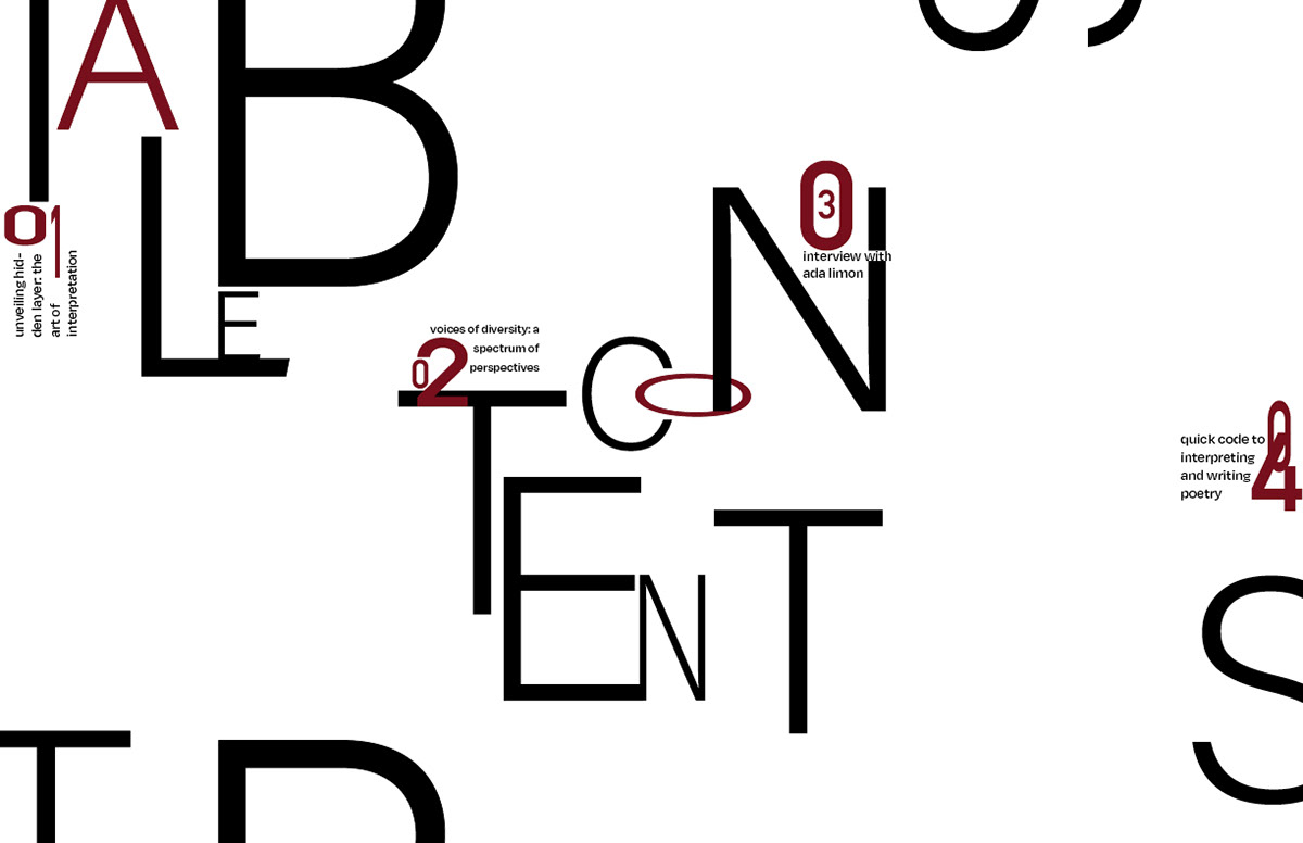
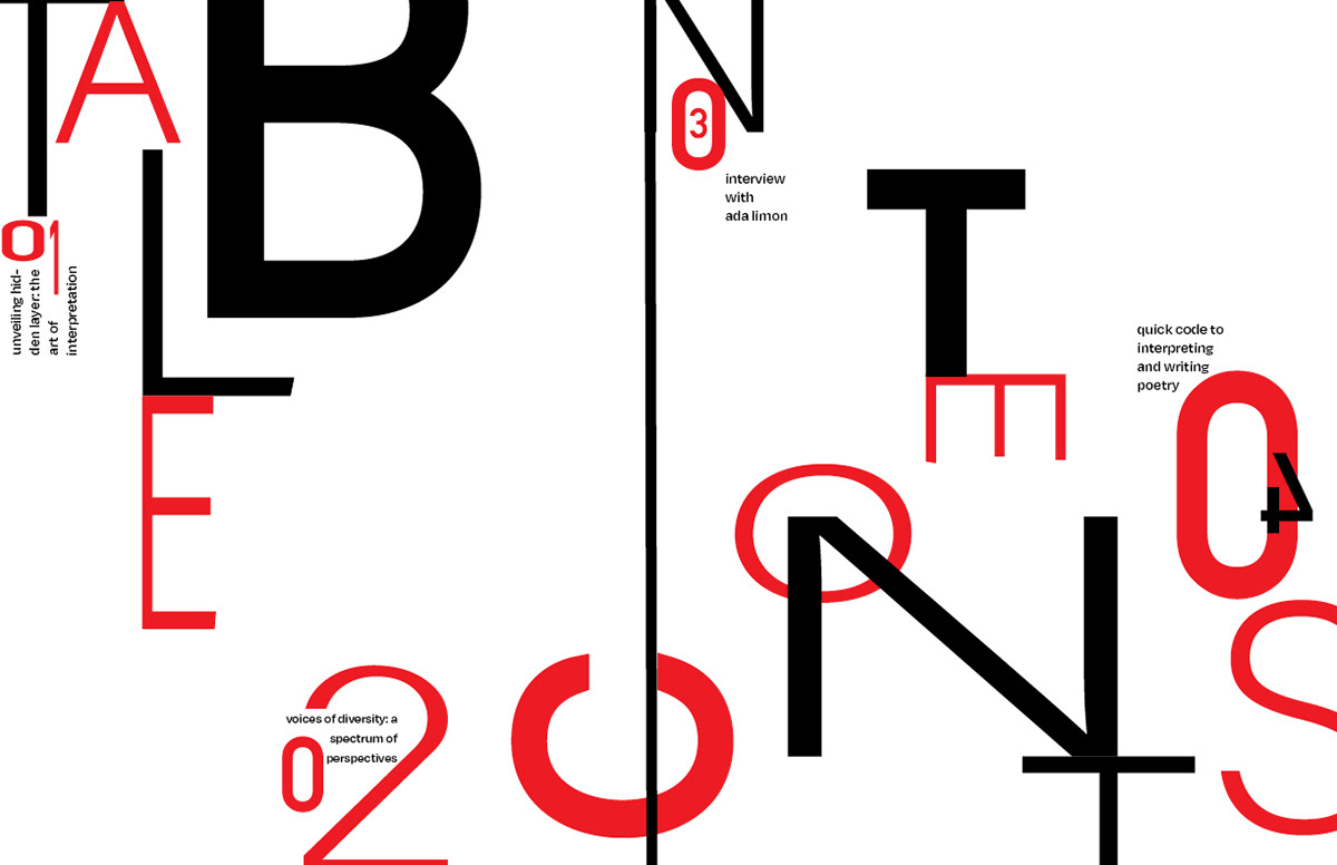
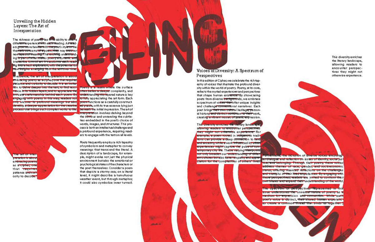
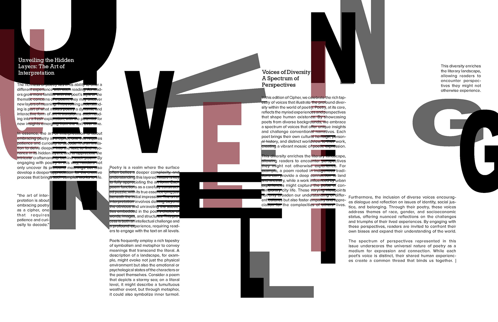
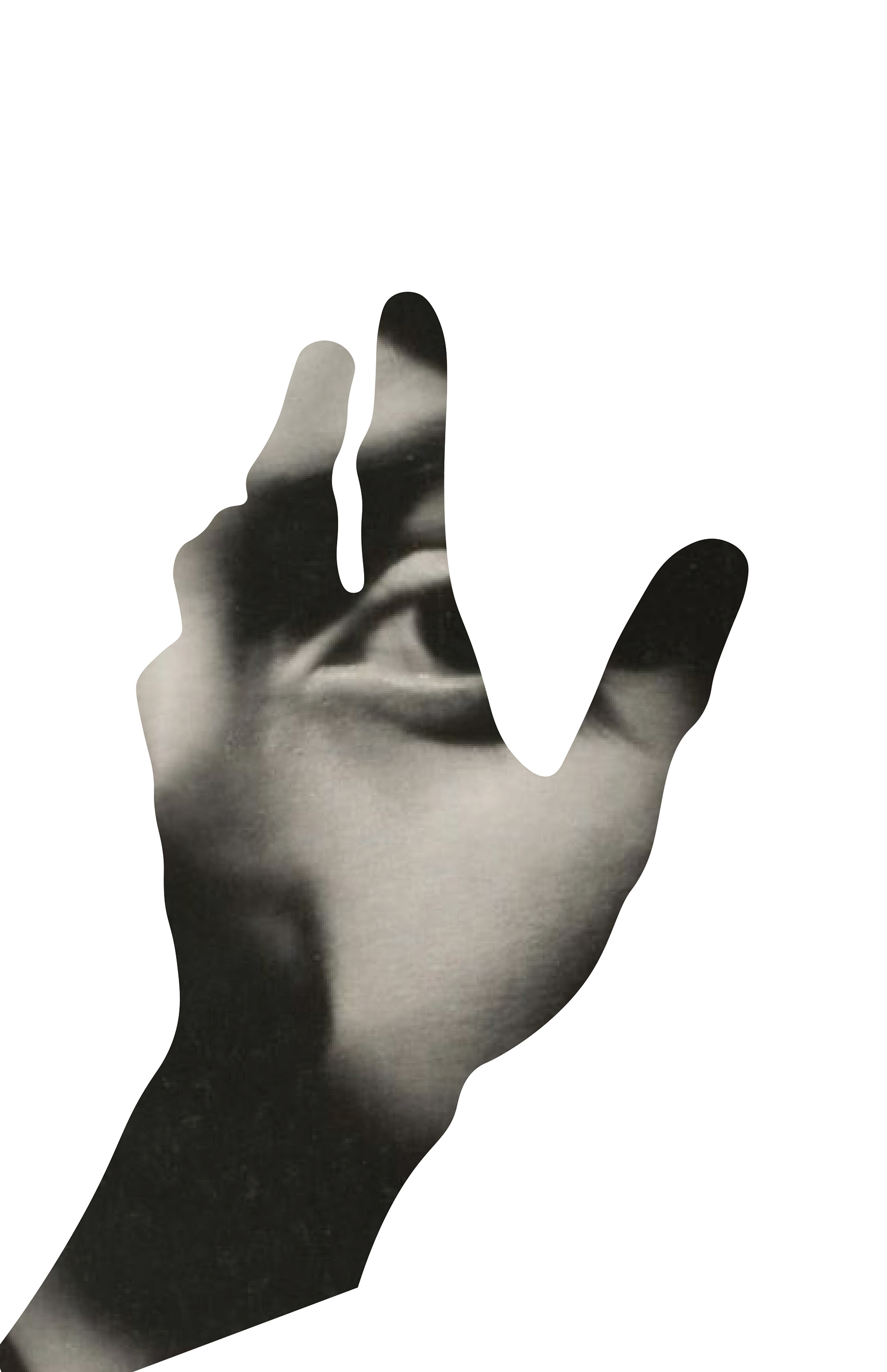
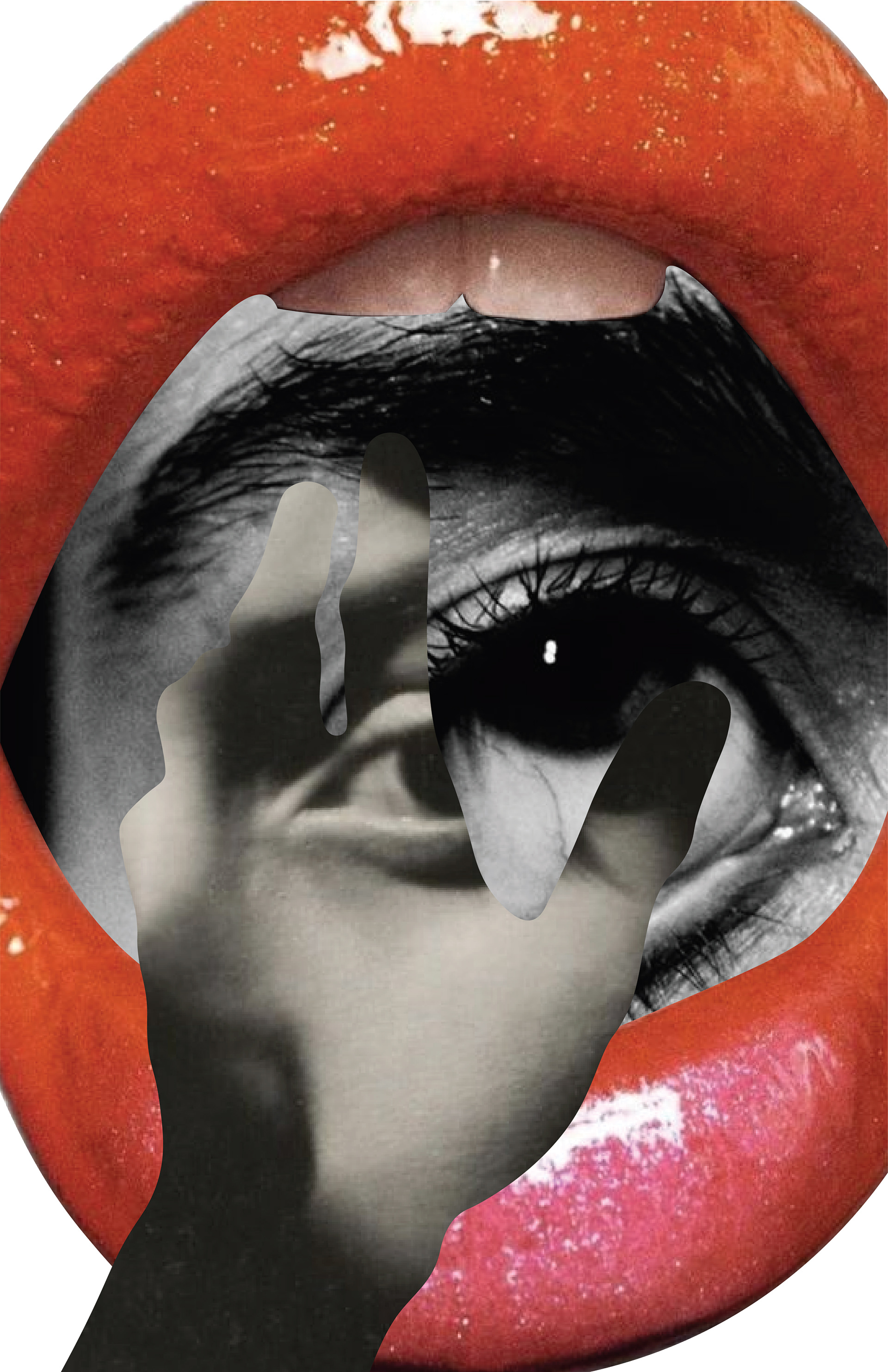
The table of content was important for setting up the overall theme of my publication. This was where I decided on the red and black color scheme. Using clipping masks I chose bold images and made them into the letters. A major part of this layout was the proximity and spacing of the letters and numbers.
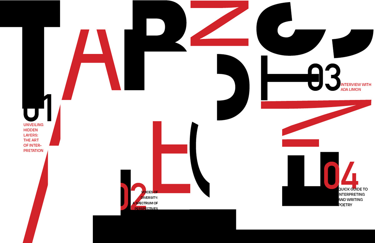
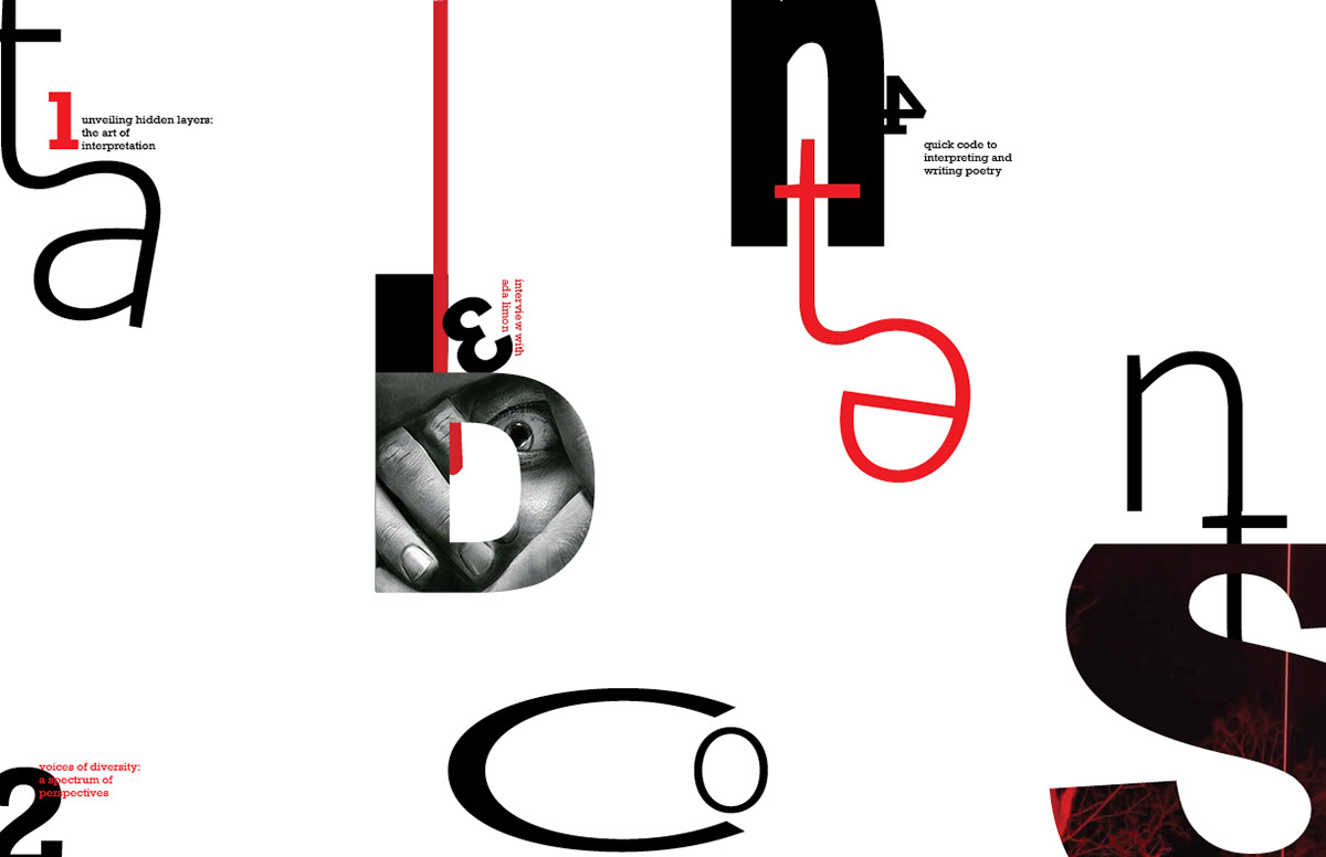
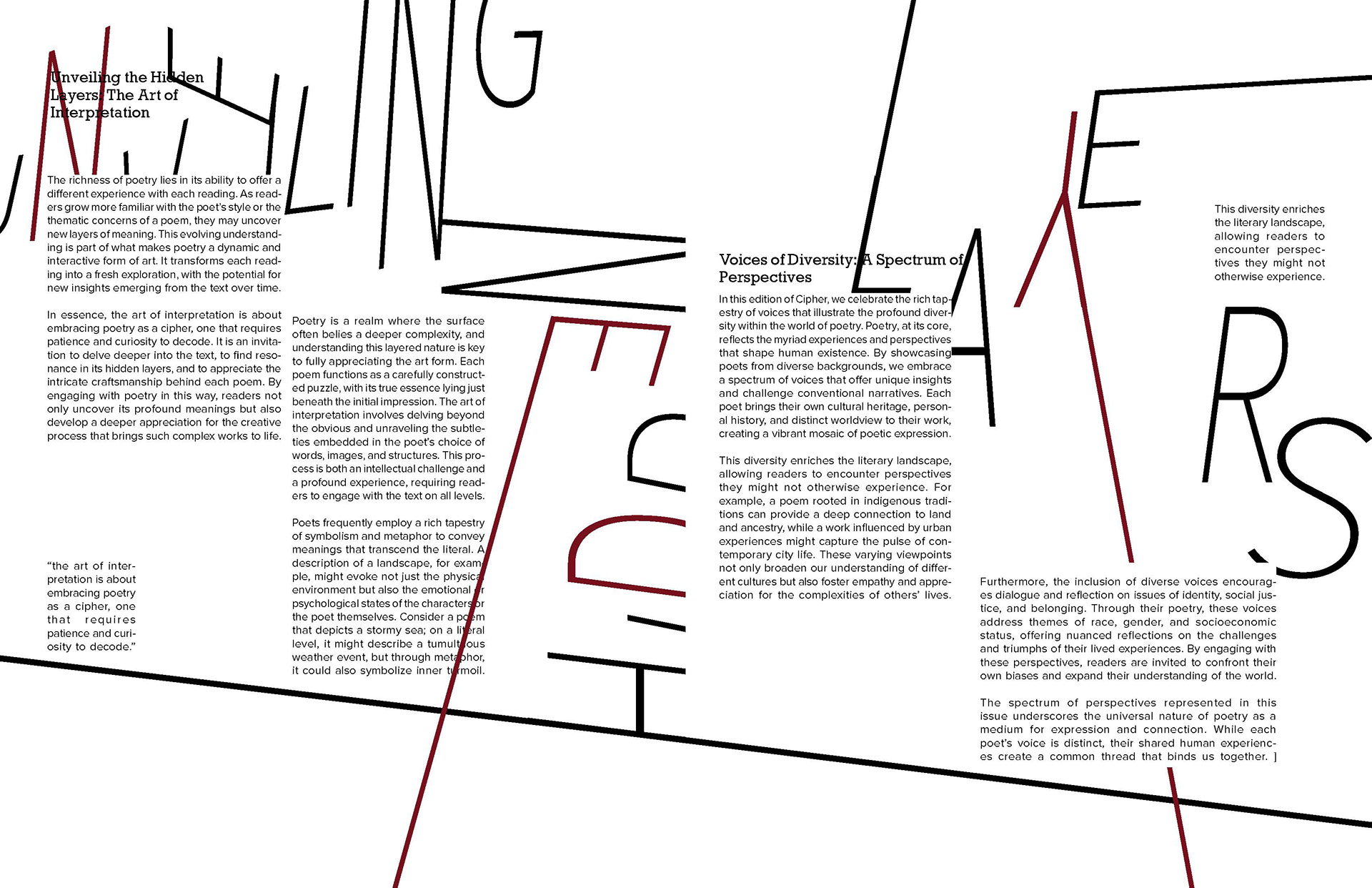
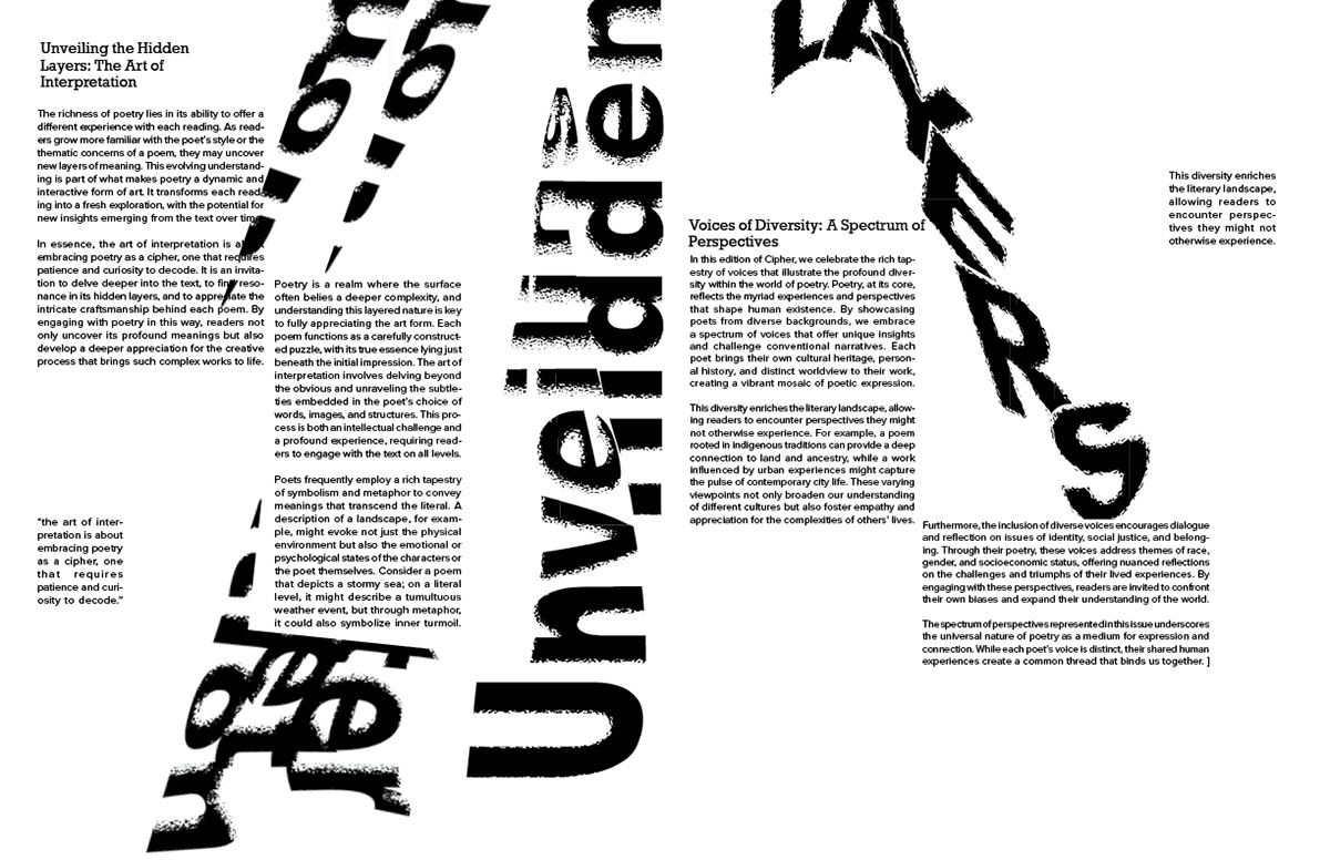
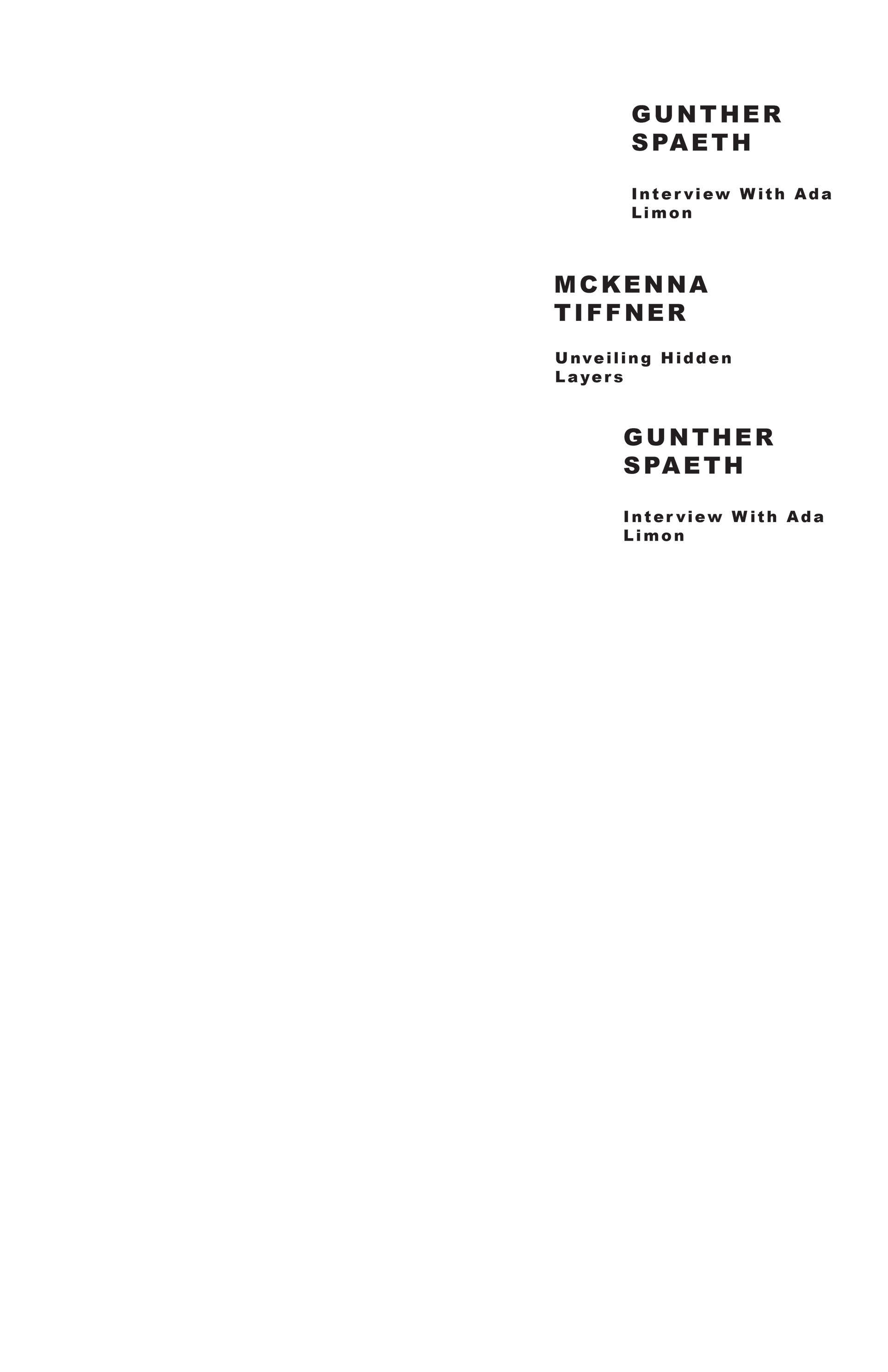
Article Process
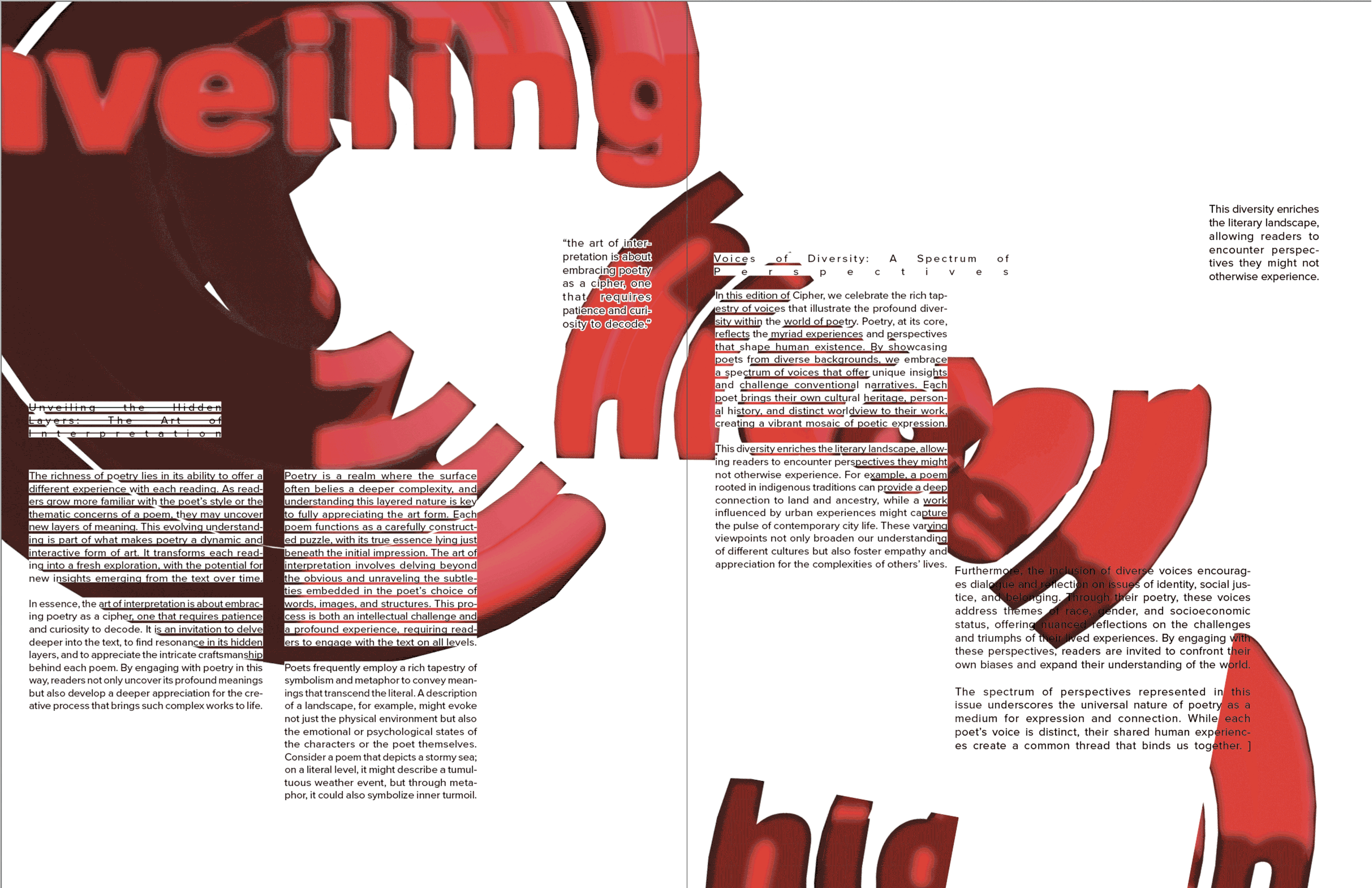
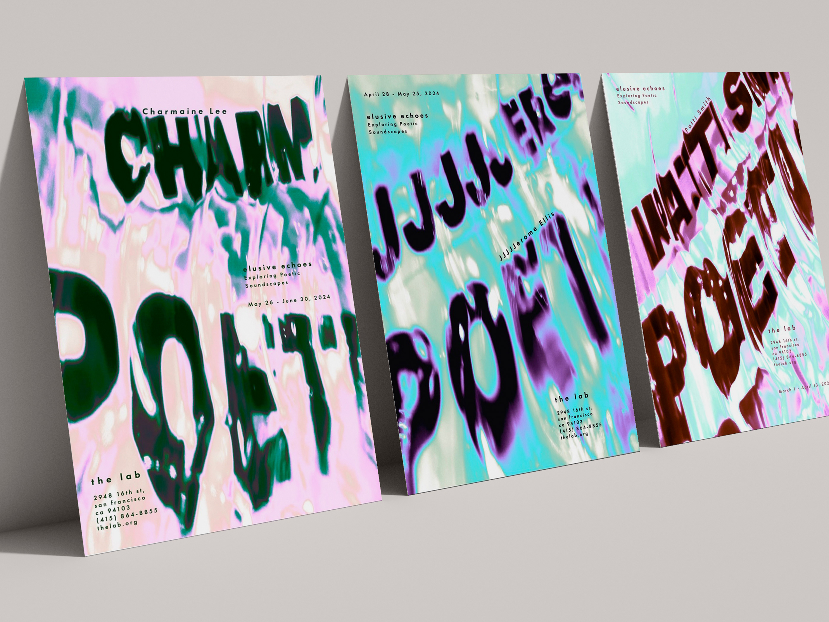
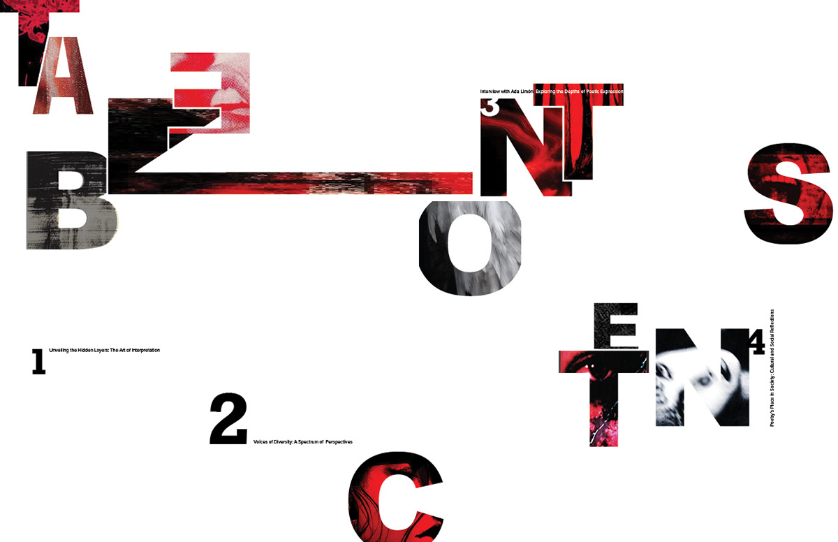
Final Articles
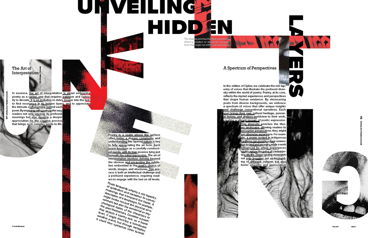
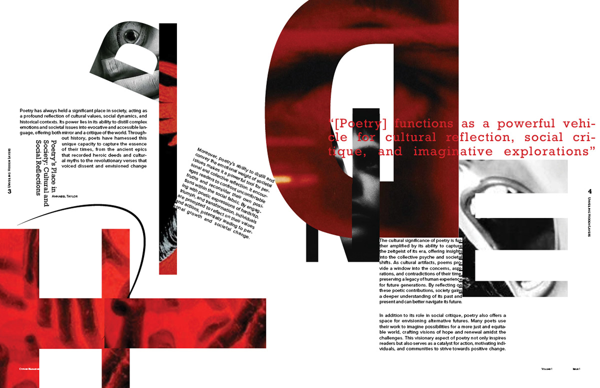
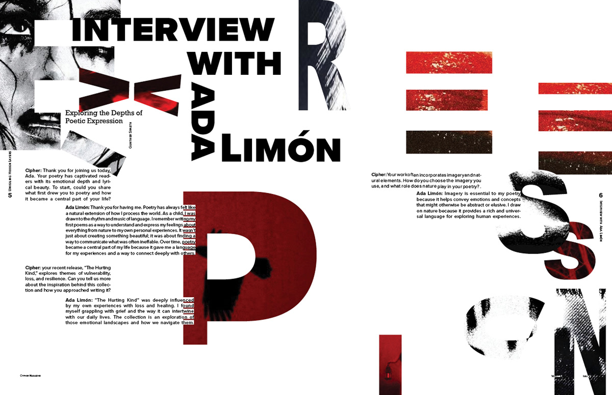
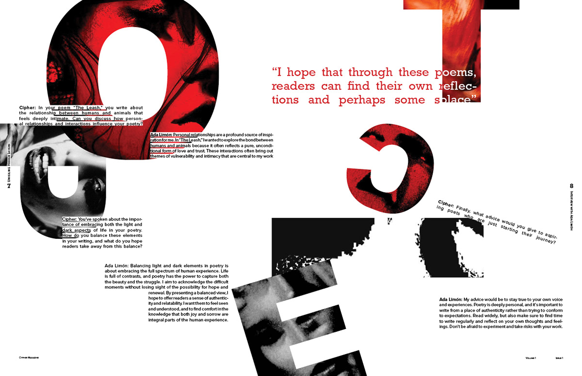
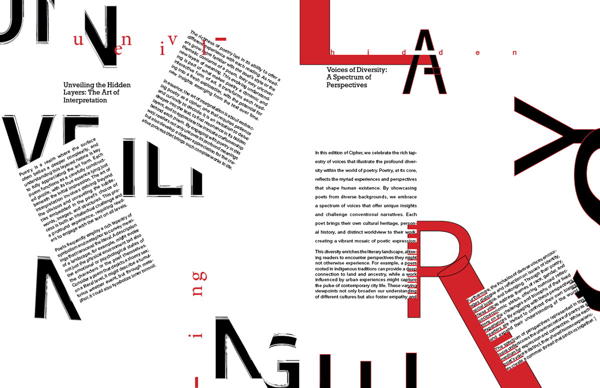
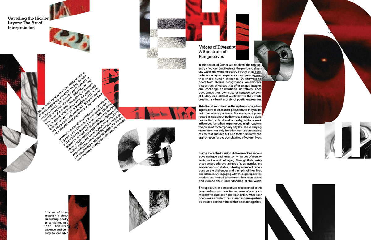
For the articles, I continued messing around with spacing, but also sizing. The contrast and fragmentation of the letters was intentional to bring about intrigue.
Cover Process


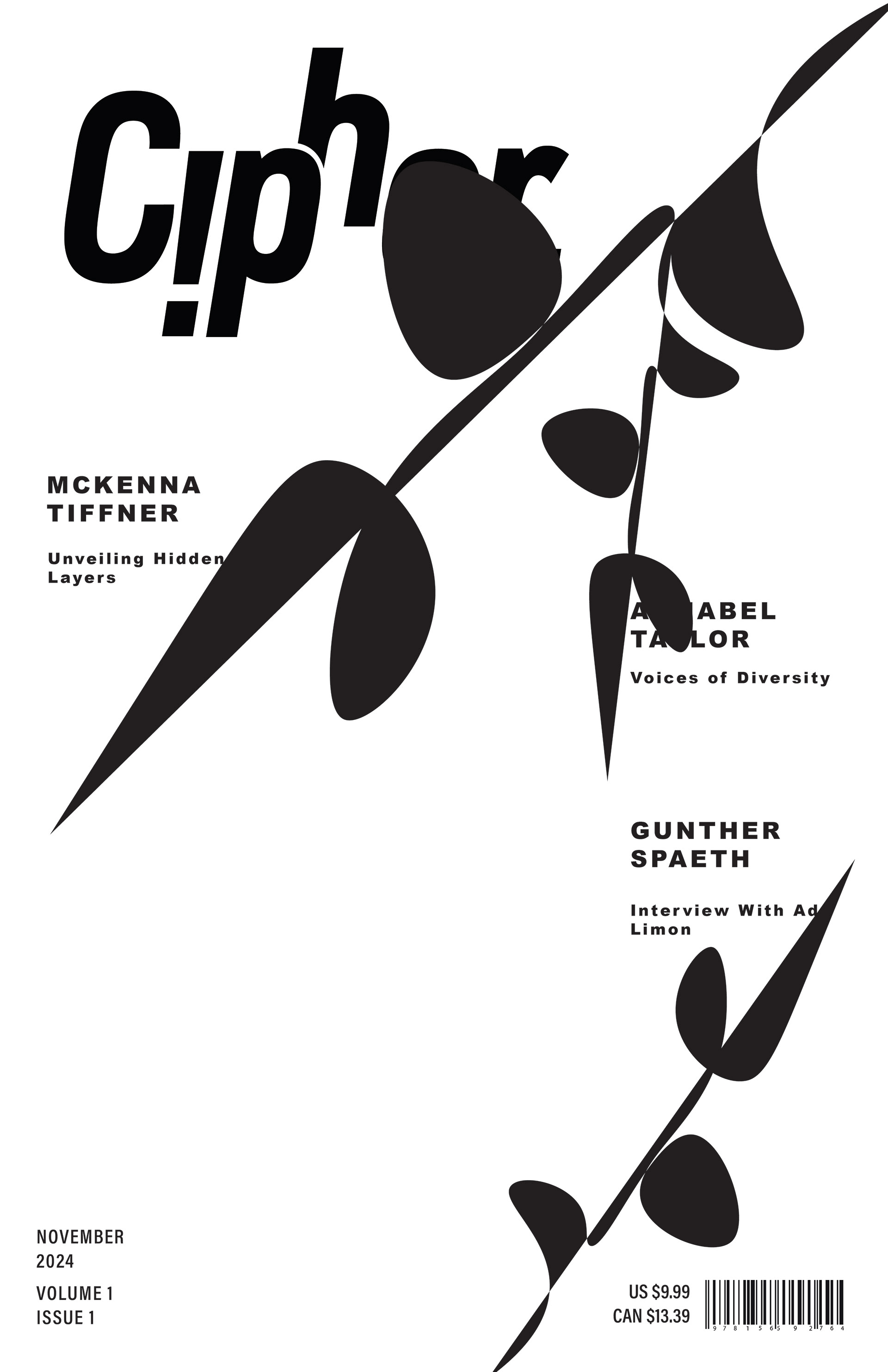
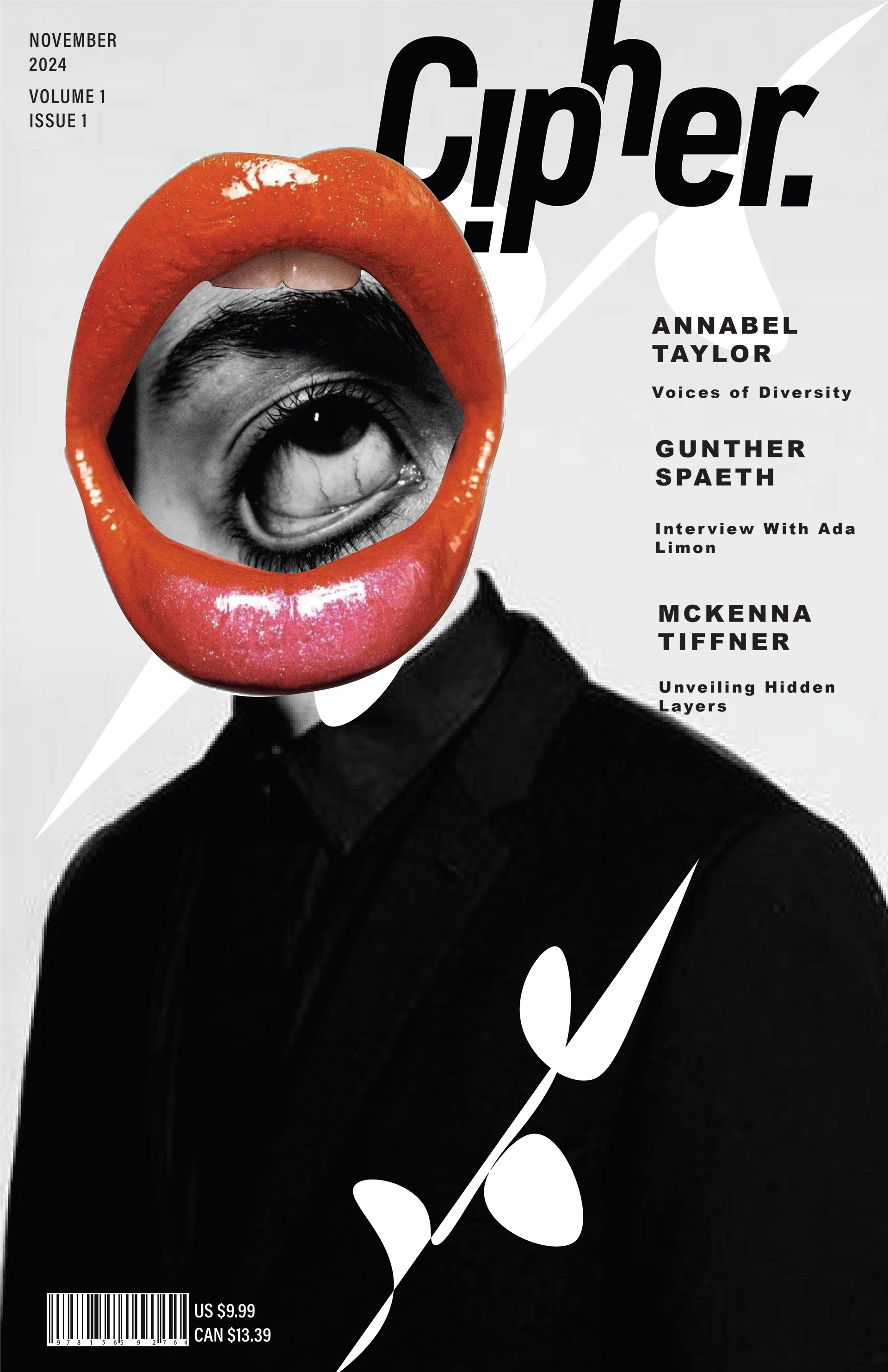
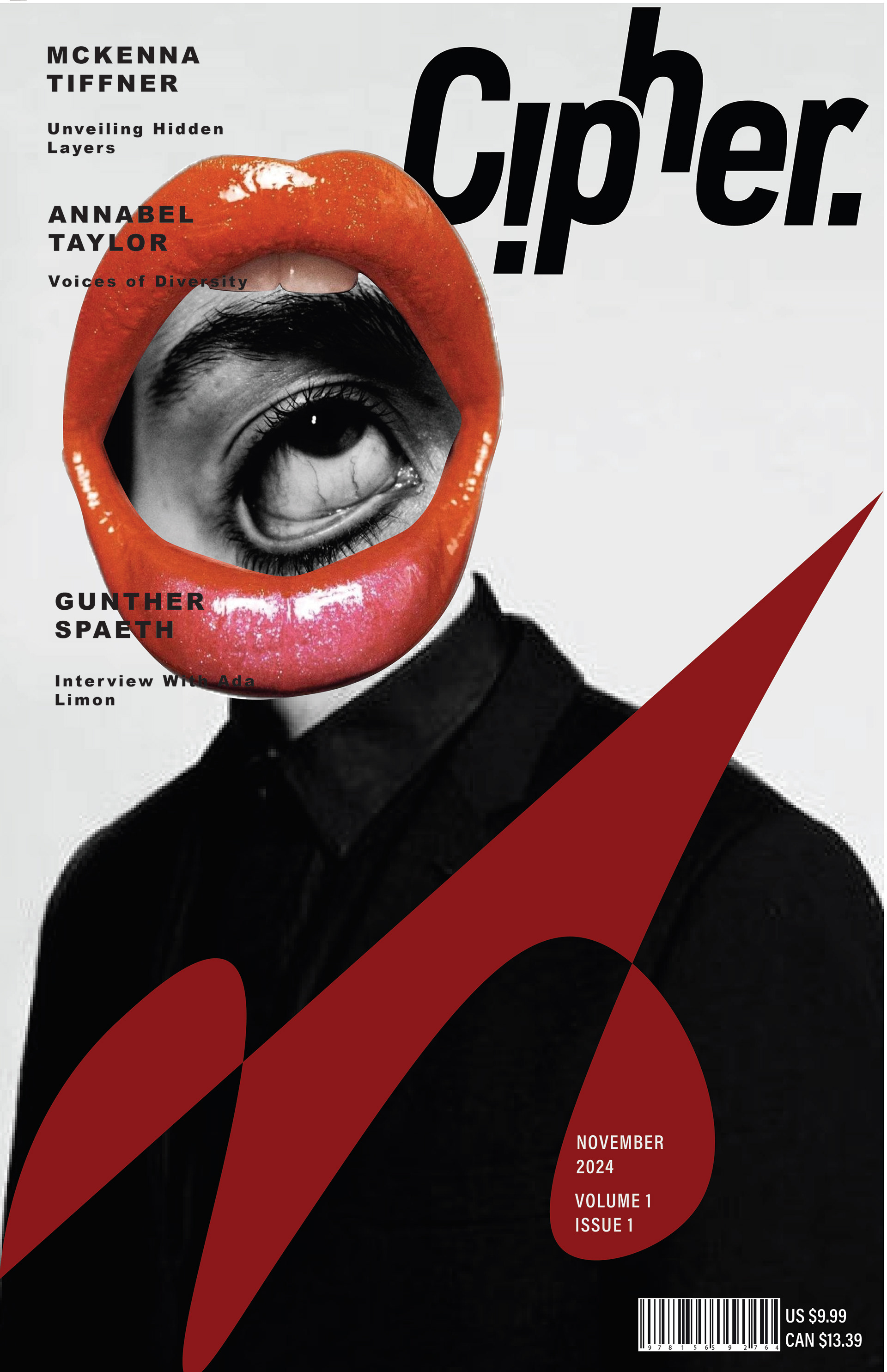
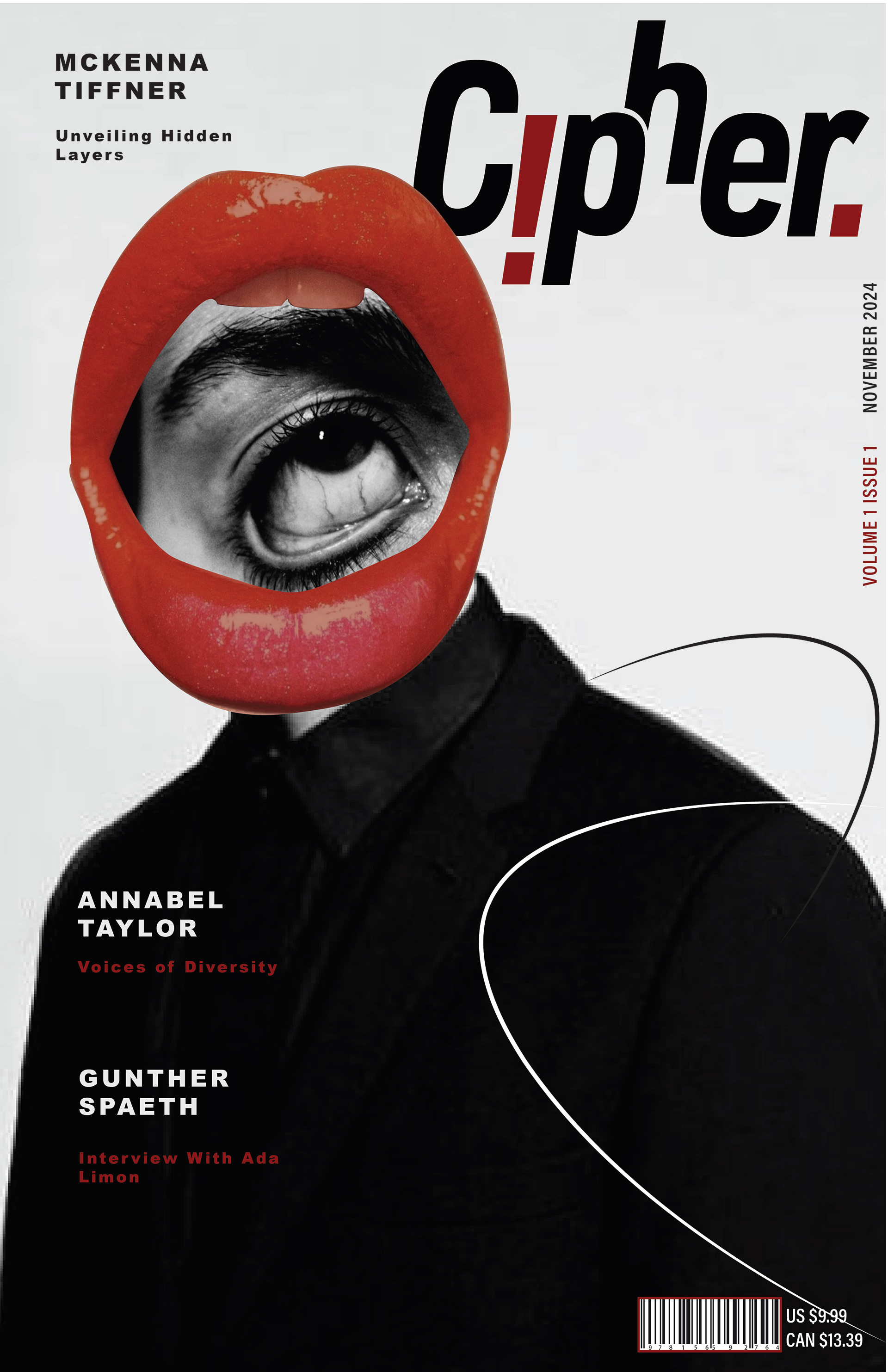
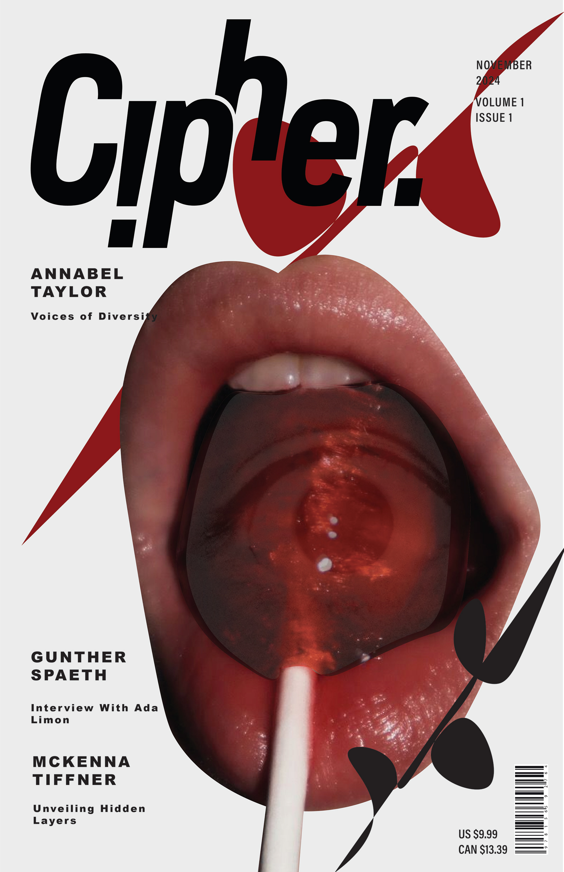
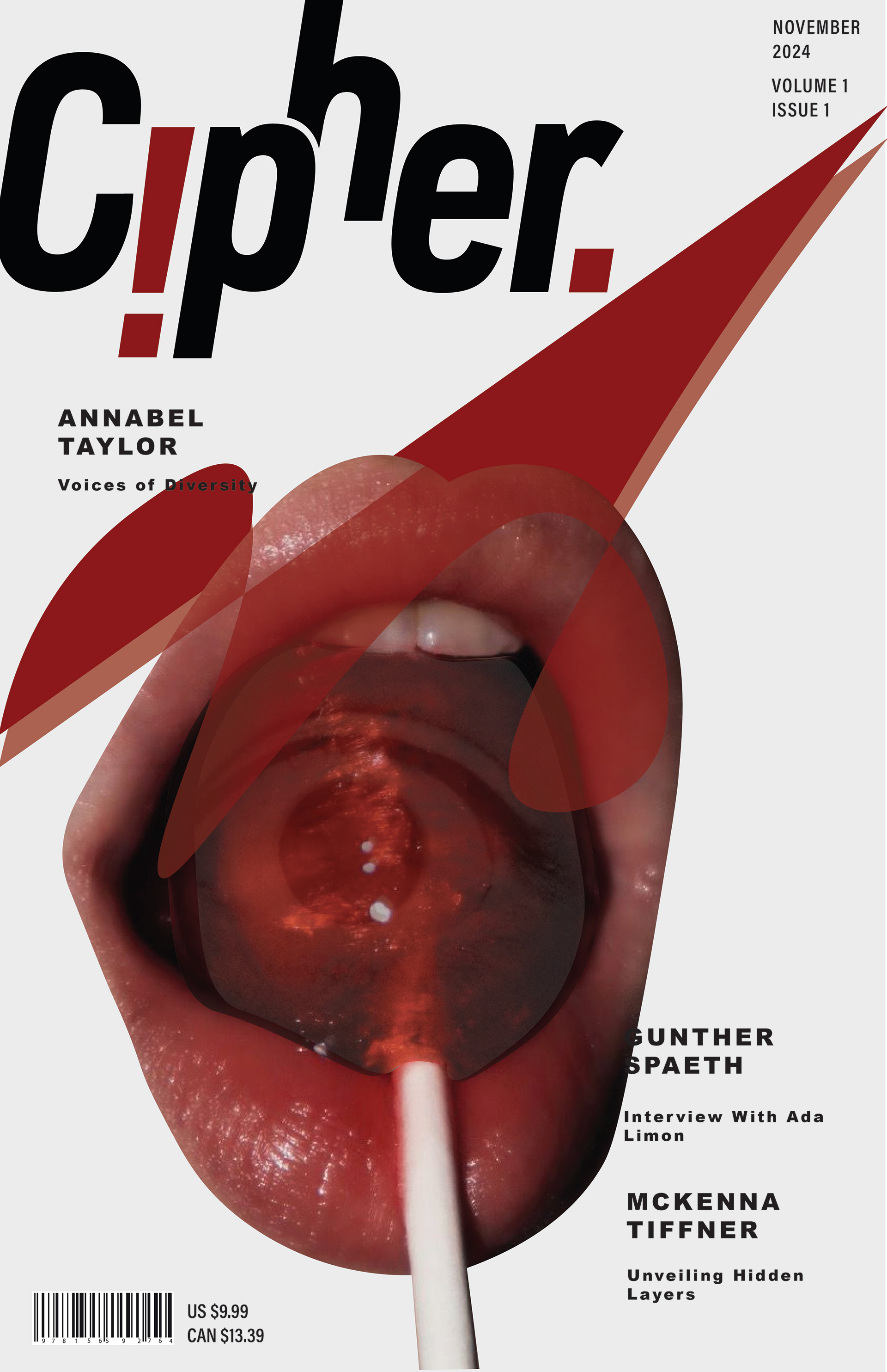
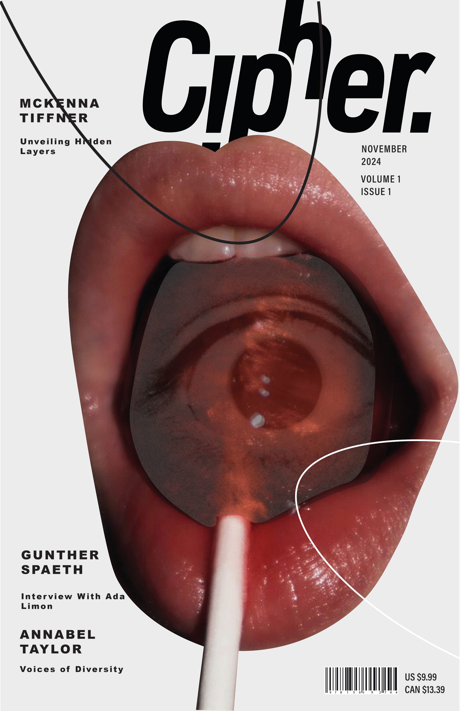
I wanted the cover to match the feel of the articles and table of contents in feel and color, but not composition. I feel like the collage approach allowed me to explore new skills, especially in photoshop. I also made the design choice to make the exclamation point and period a deep red color to make it stand out further.
Final Cover

Visual System